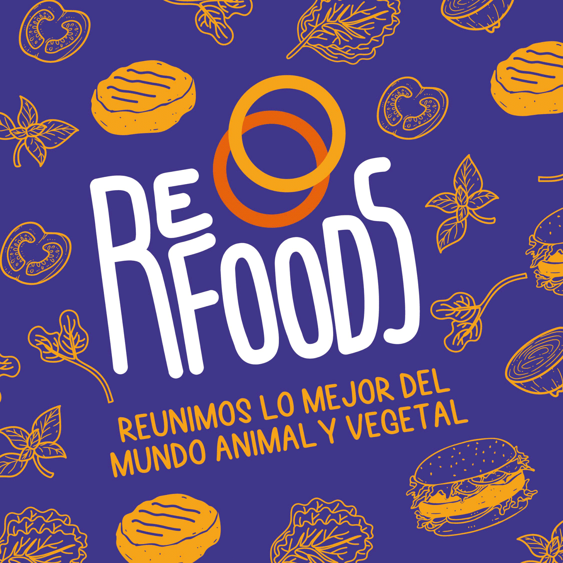
Refoods.
Con "Re" de resignificar la marca.
Cuando Refoods llegó a nosotros, encontramos un equipo joven de nuevos líderes. En el ambiente había muchas ganas de hacer algo innovador, disruptivo y con sentido socioambiental pero si queríamos acelerar el desarrollo de este negocio de manera eficiente, necesitábamos encontrar un posicionamiento realmente único.
Cuando hablamos de una foodtech, se nos vienen todos estos conceptos actuales que están de moda como las startups, inteligencia artificial, unicornios, tecnología, fundadores en portadas de revistas, etc. Y si bien, en su momento eran una evidente novedad, hoy en día ya son parte de un paisaje (o lenguaje) de nuevas marcas y productos en la industria de los alimentos.
Por lo que esa “innovación por la innovación” ya no tenía mucho sentido, ni tampoco ese tono de nuevo invento tecnológico tipo Elon Musk. Si queríamos ser innovadores, en este caso debíamos hacer todo lo contrario.
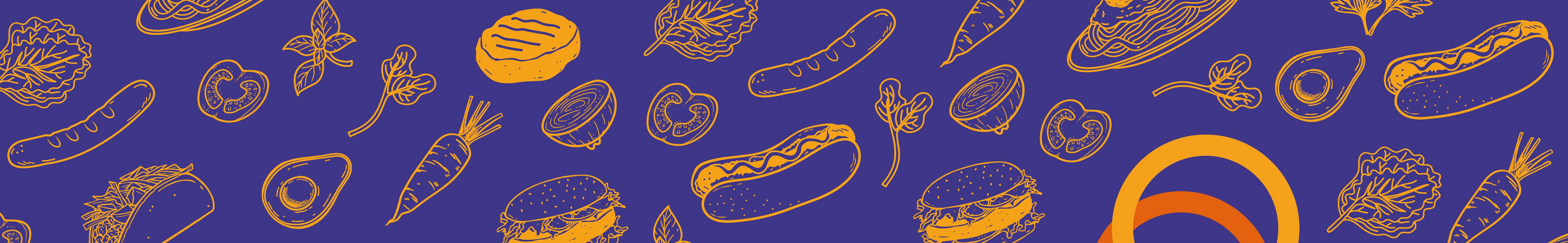
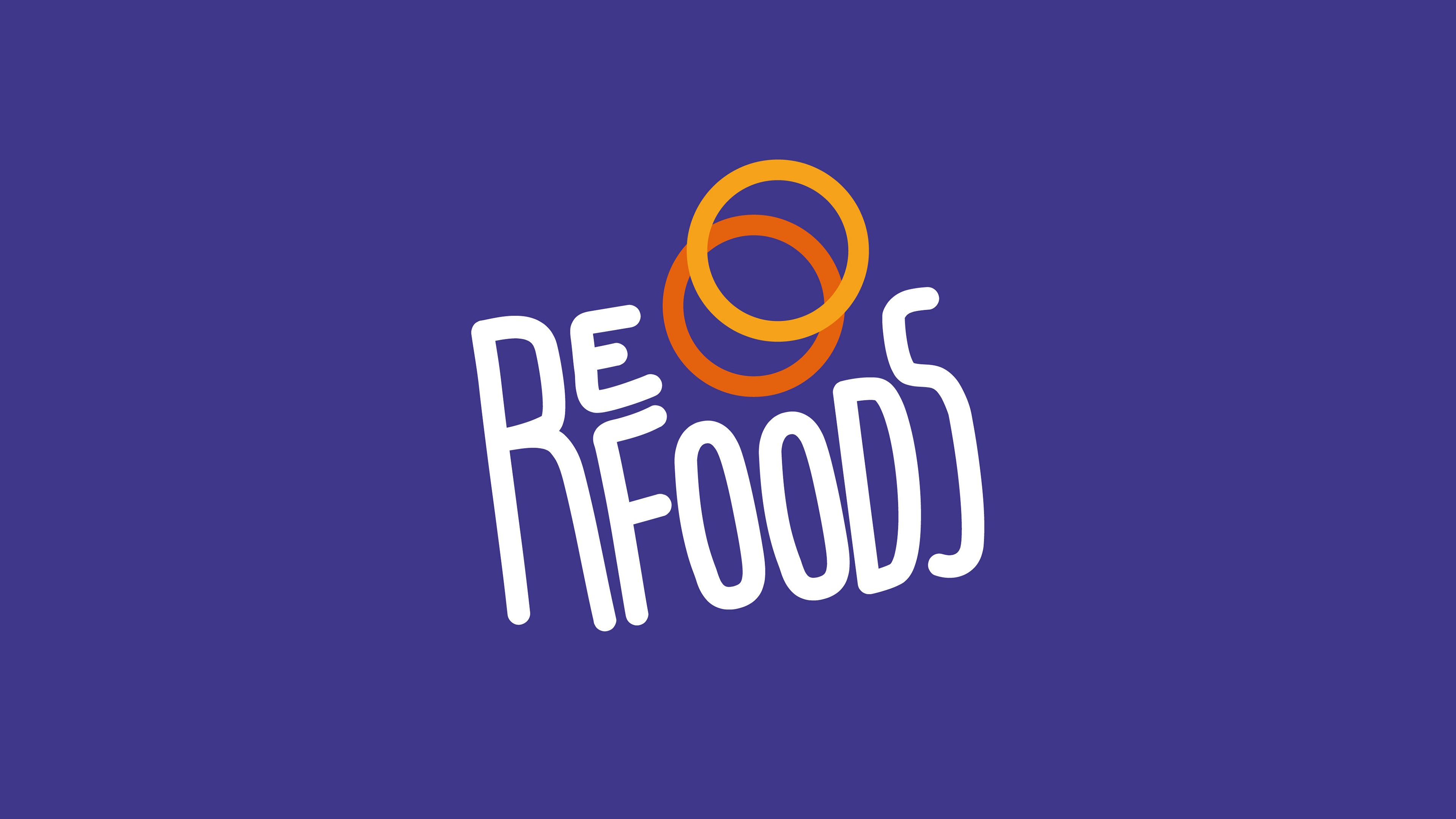
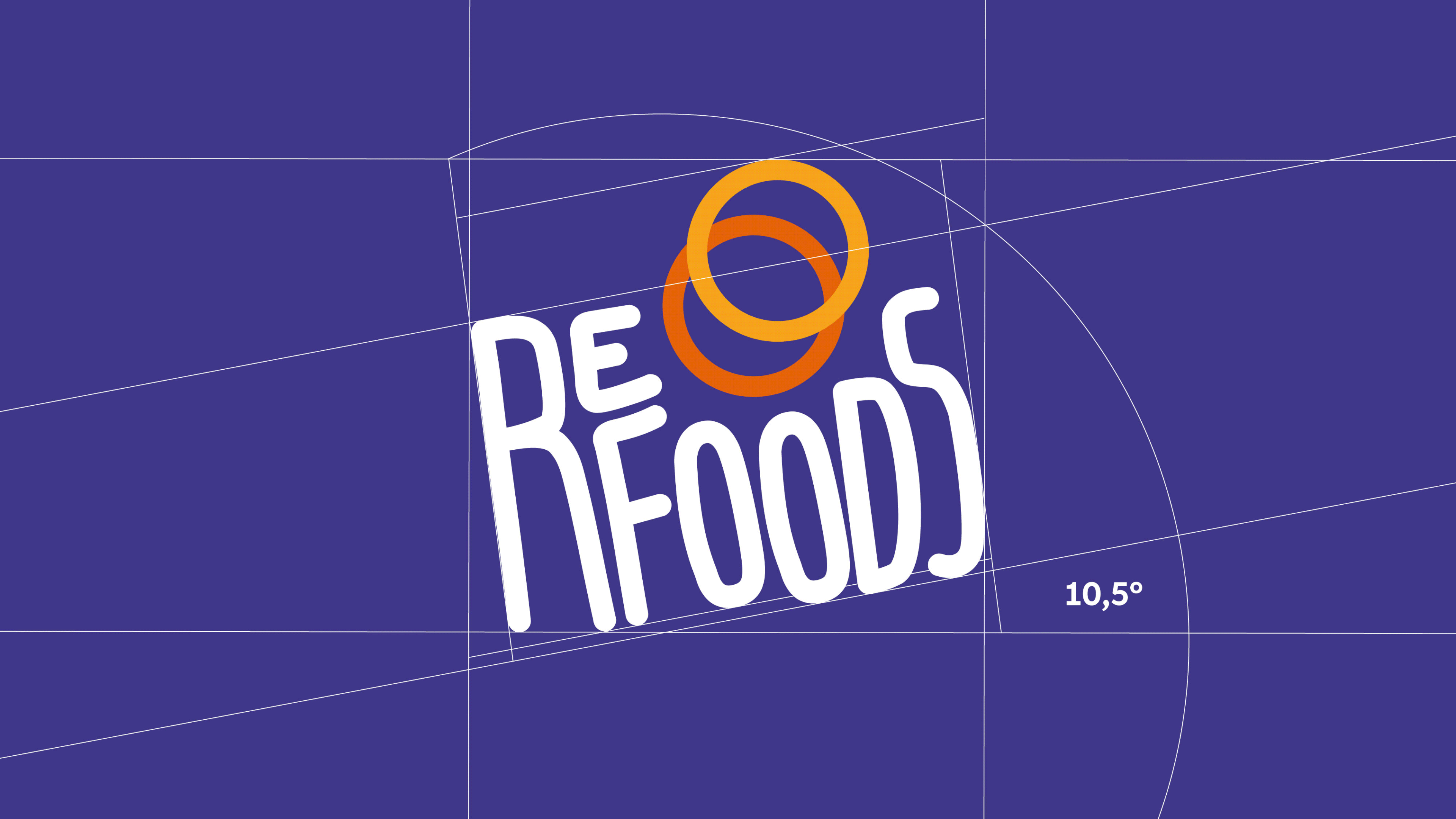
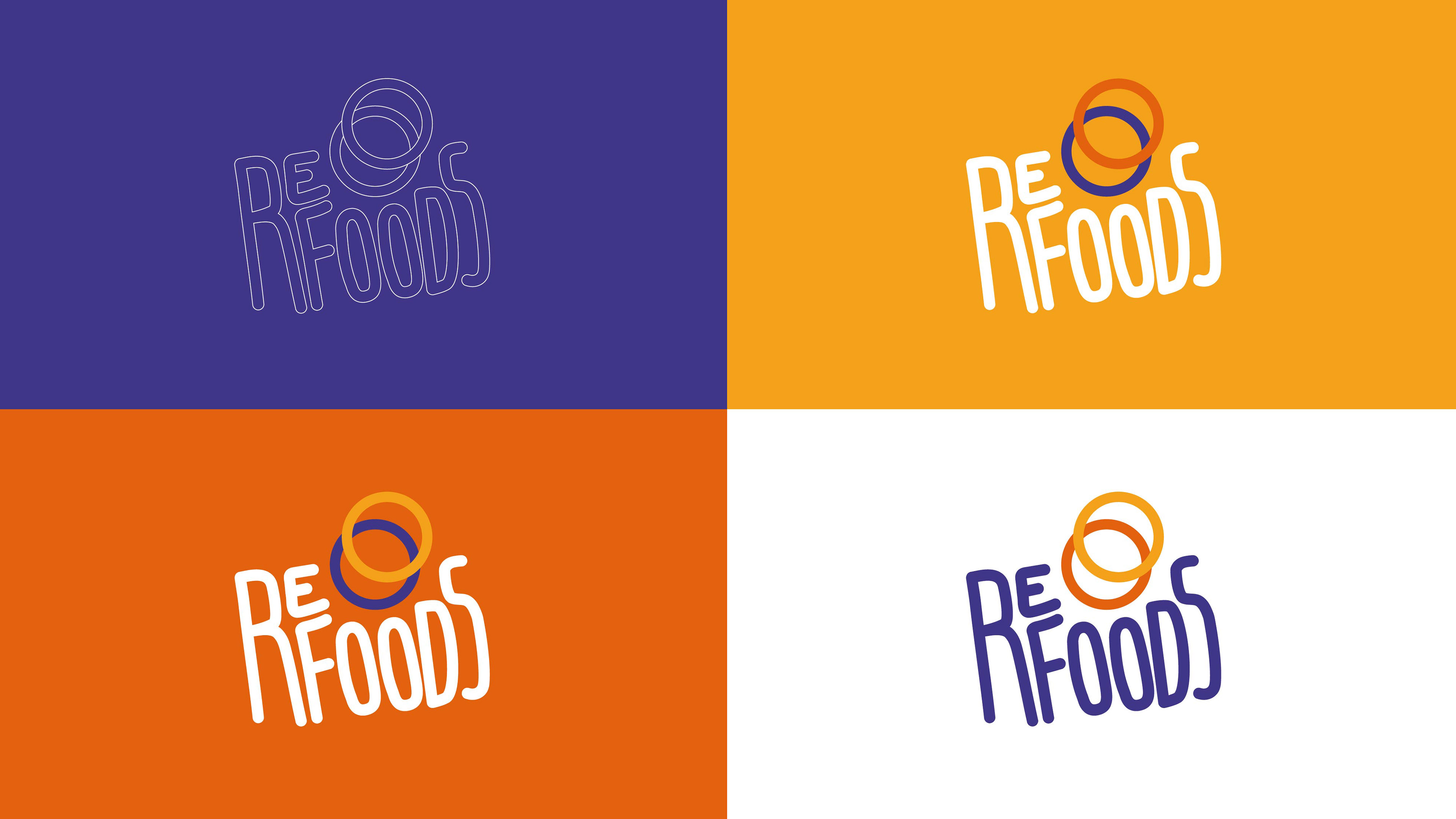
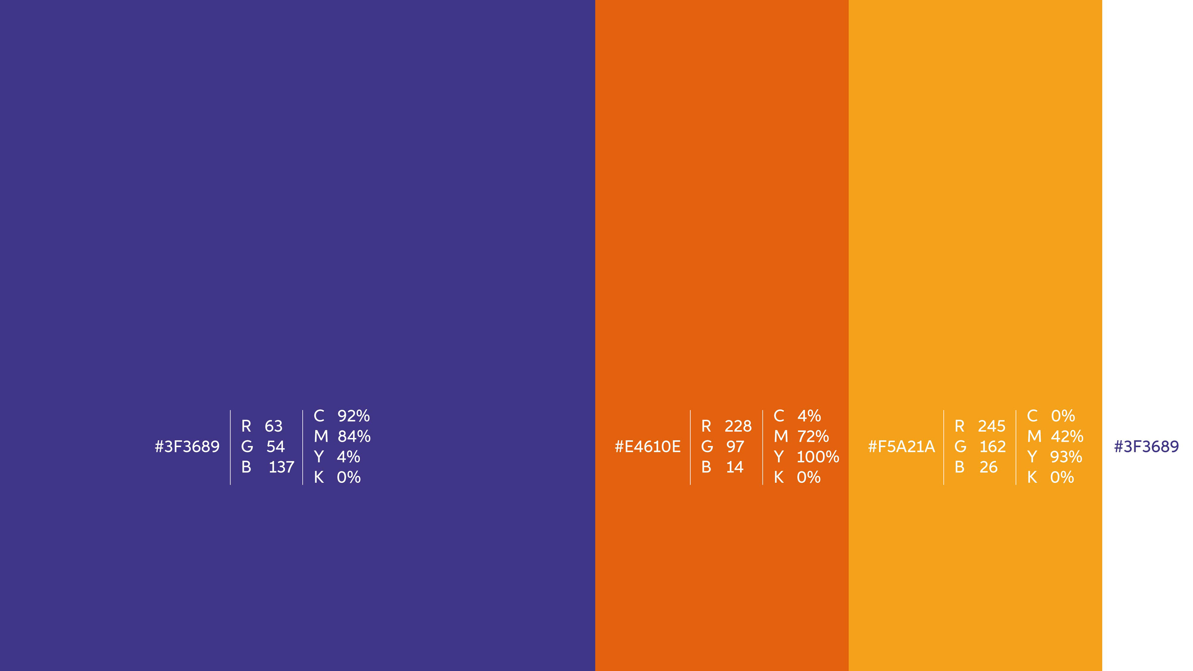
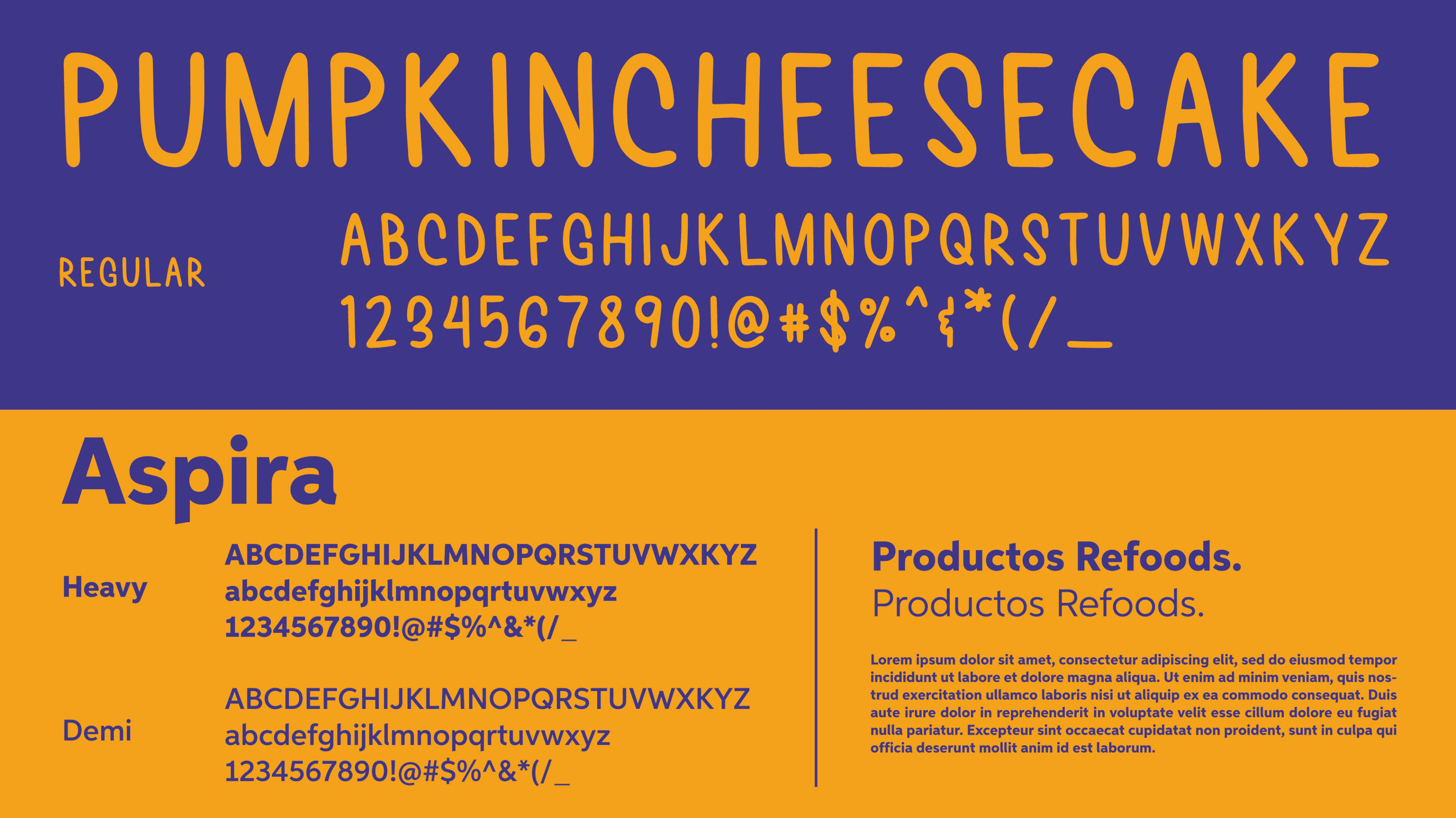
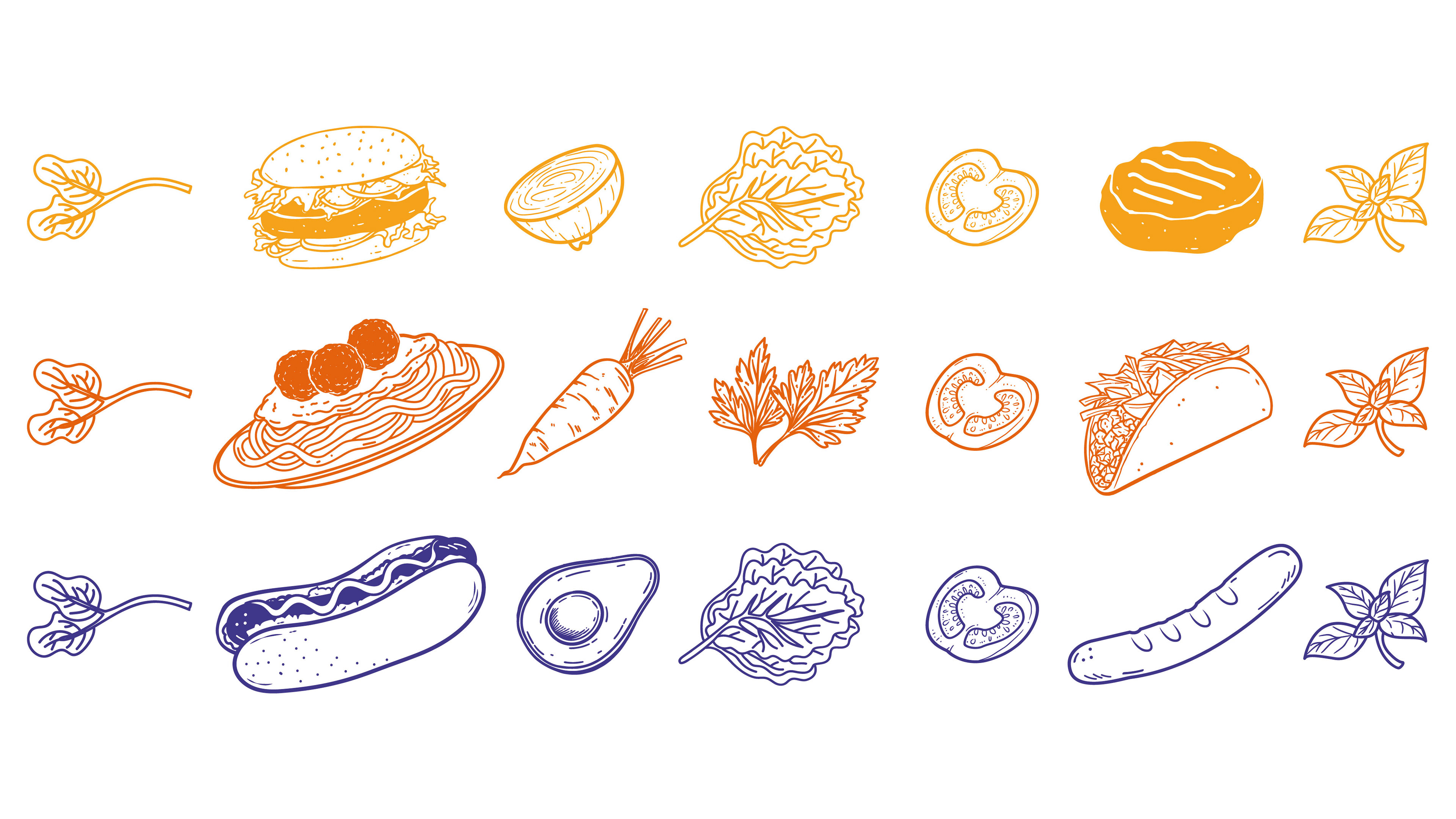
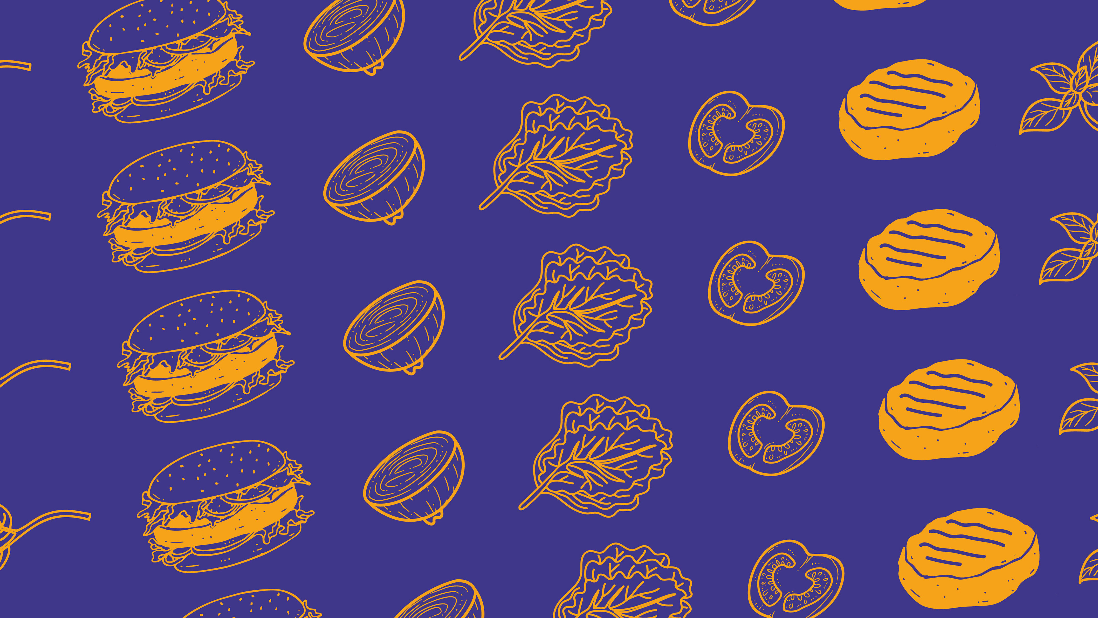
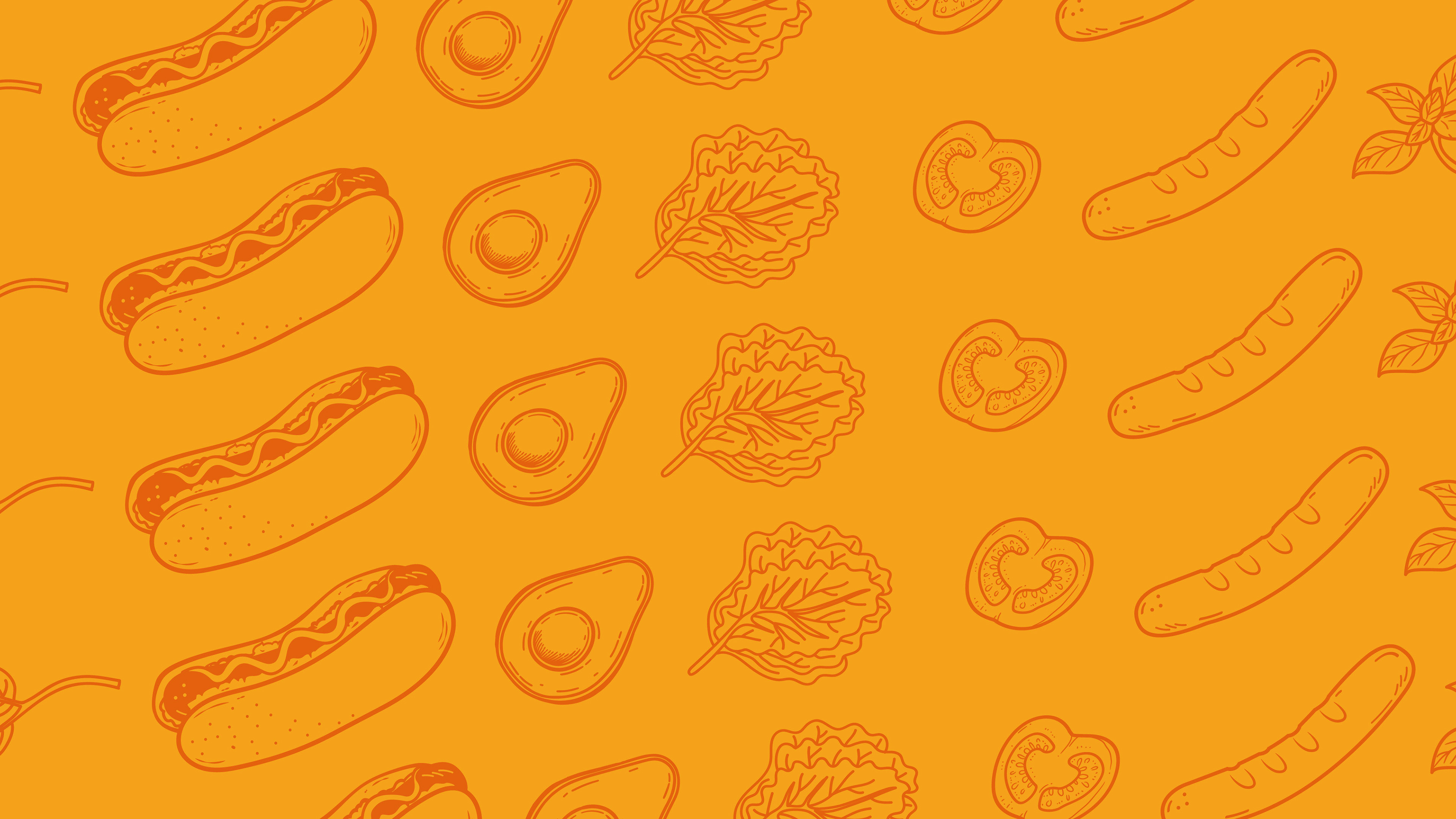
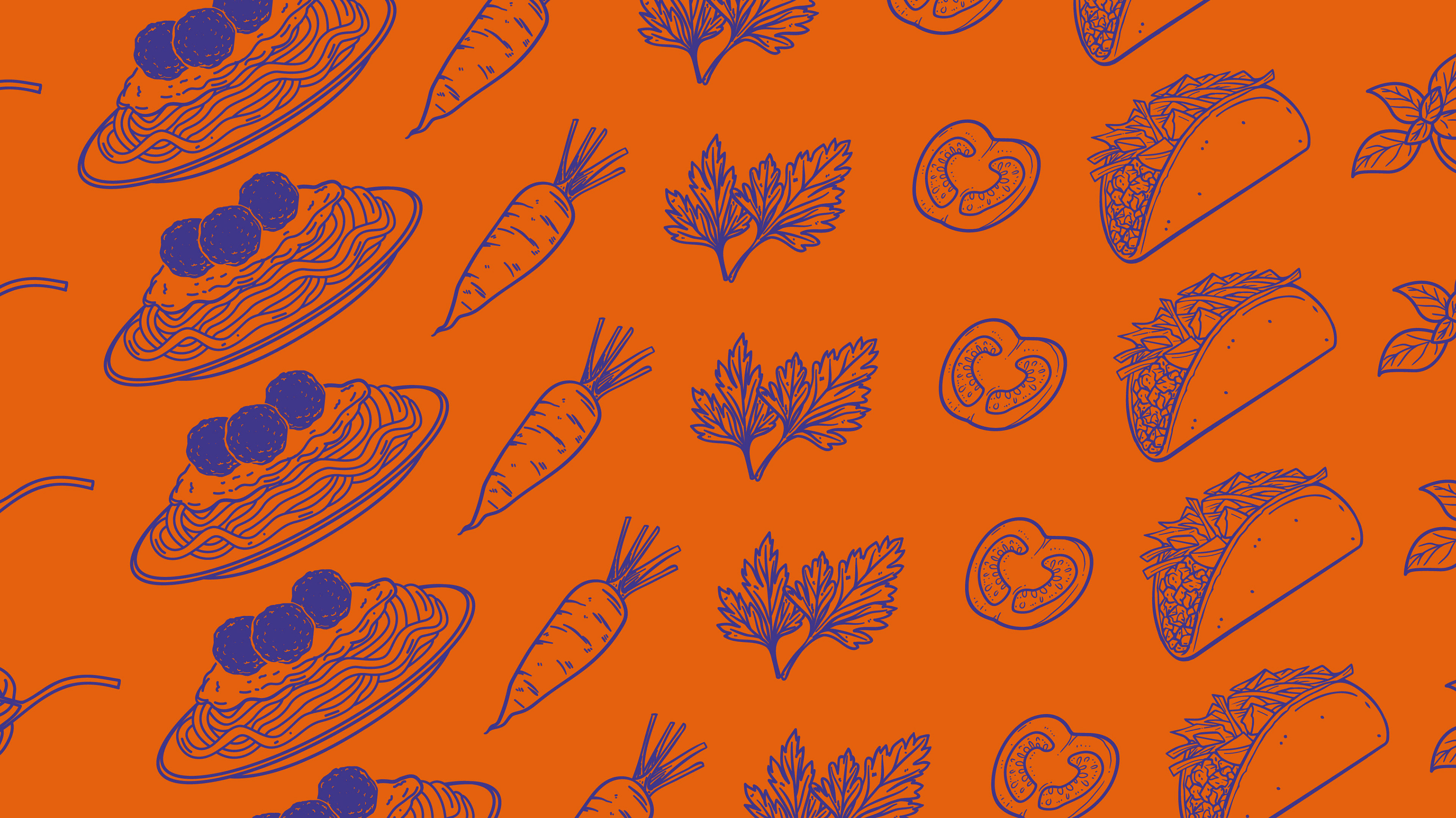
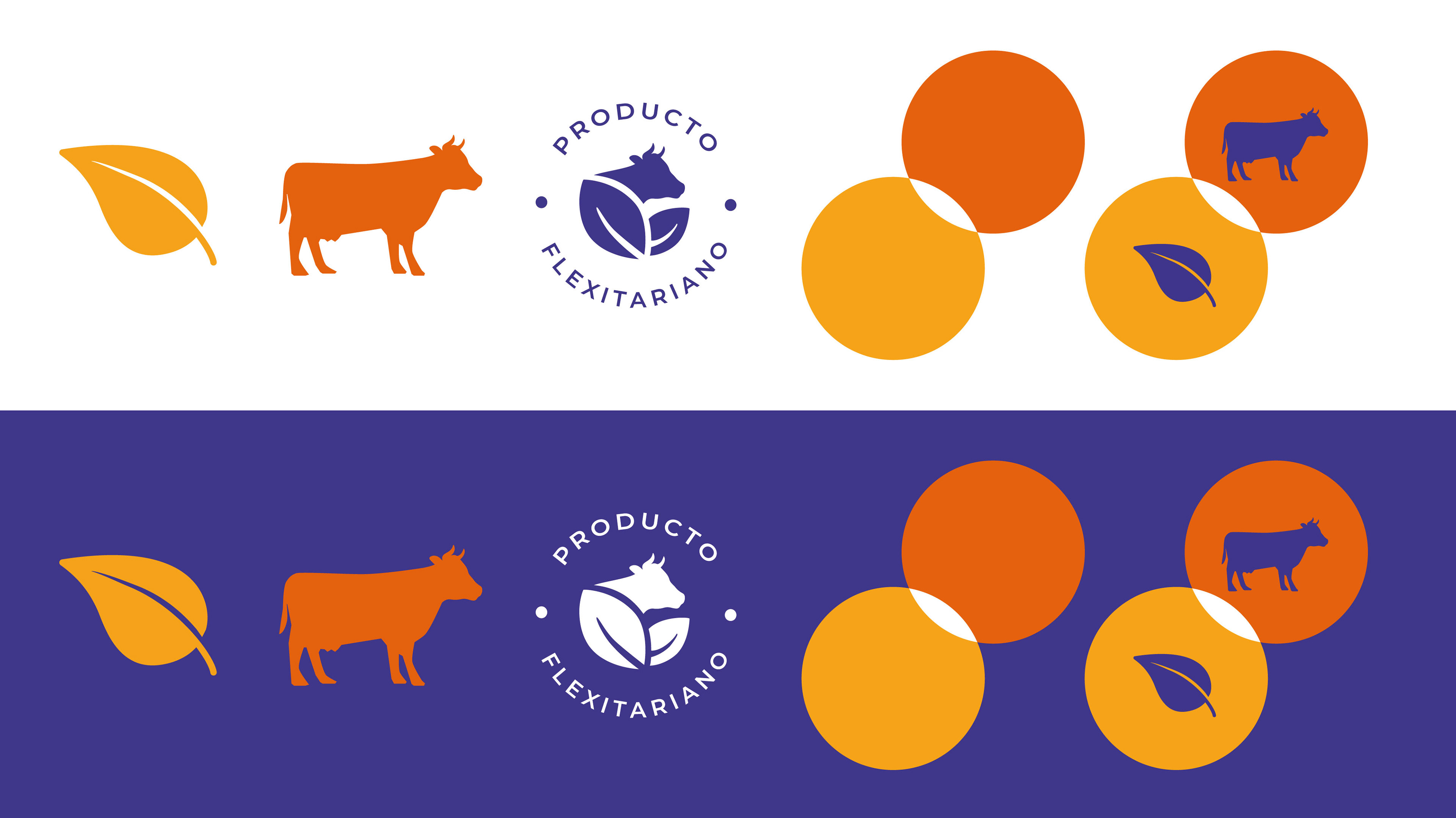
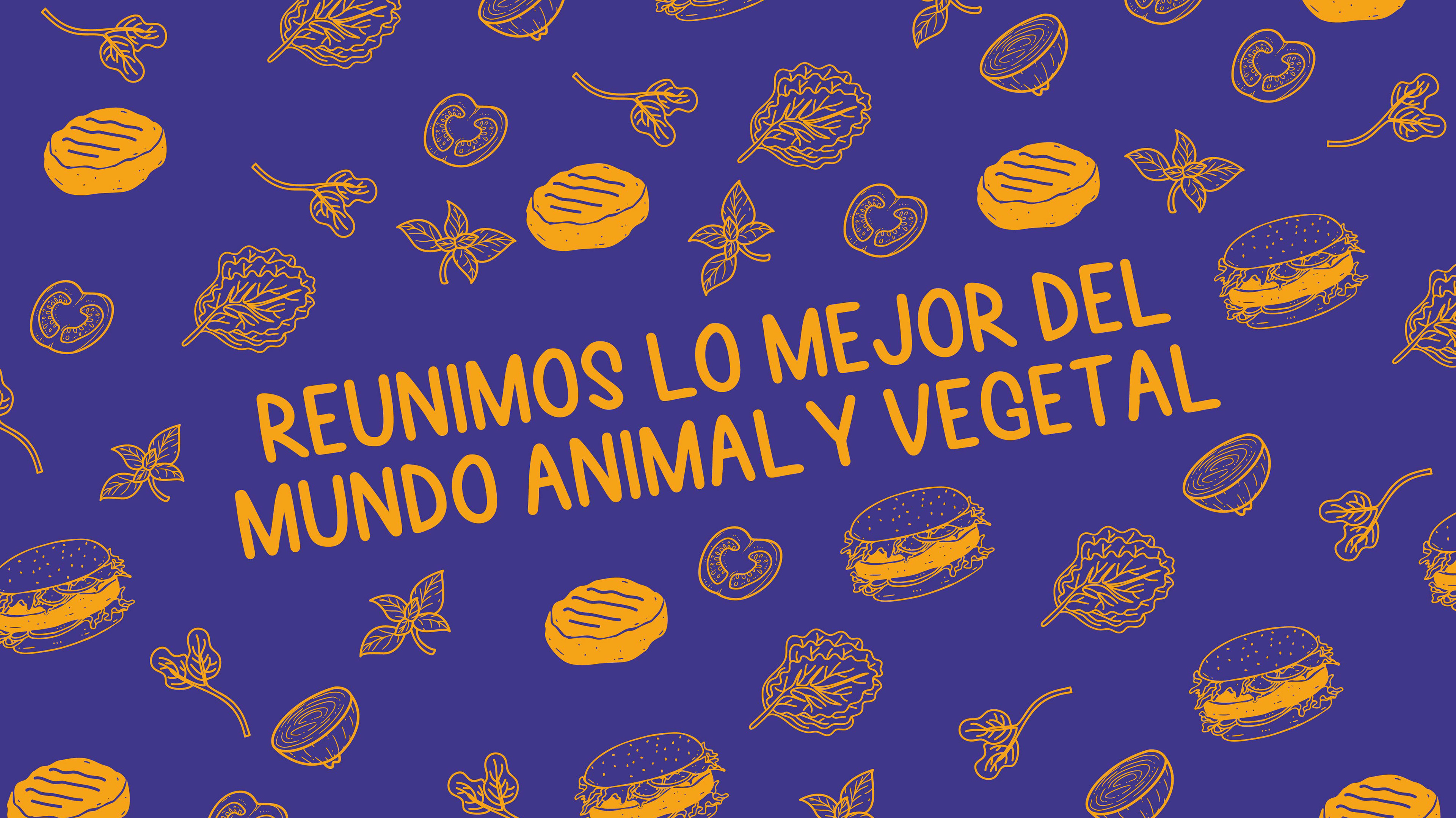
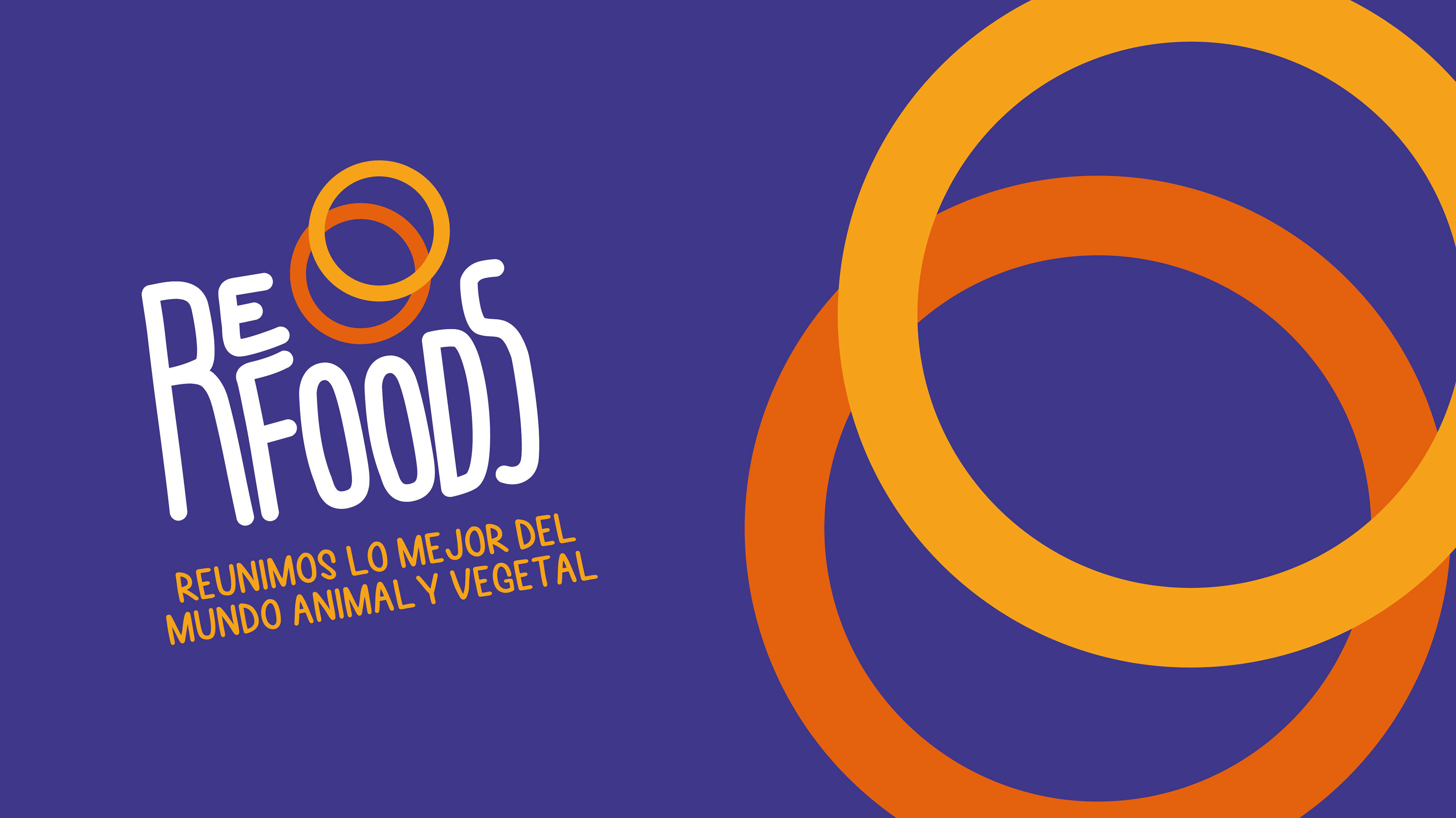
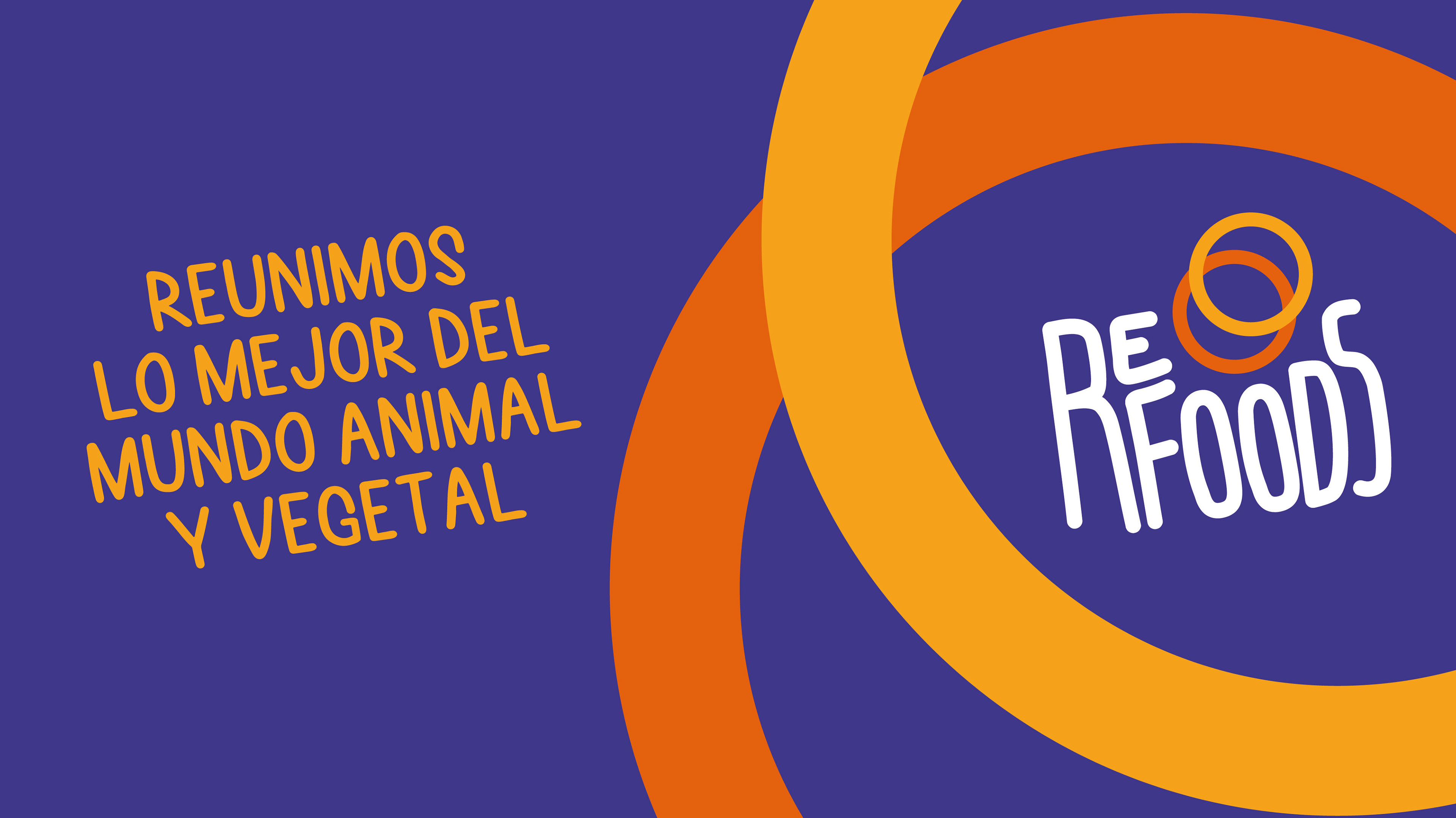
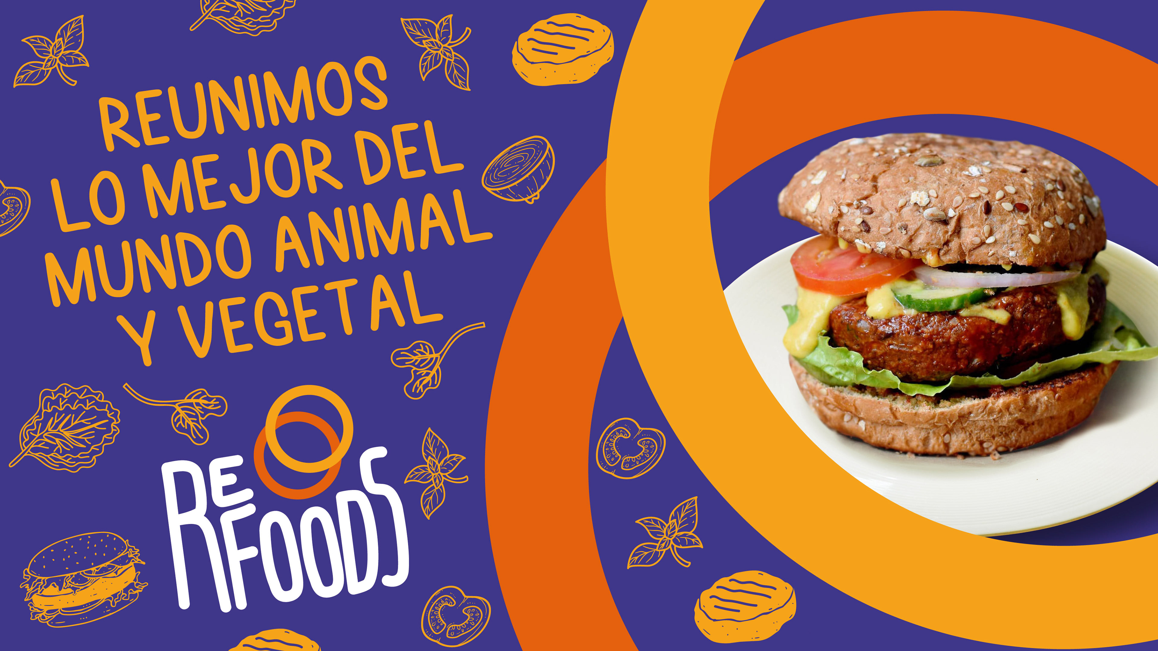
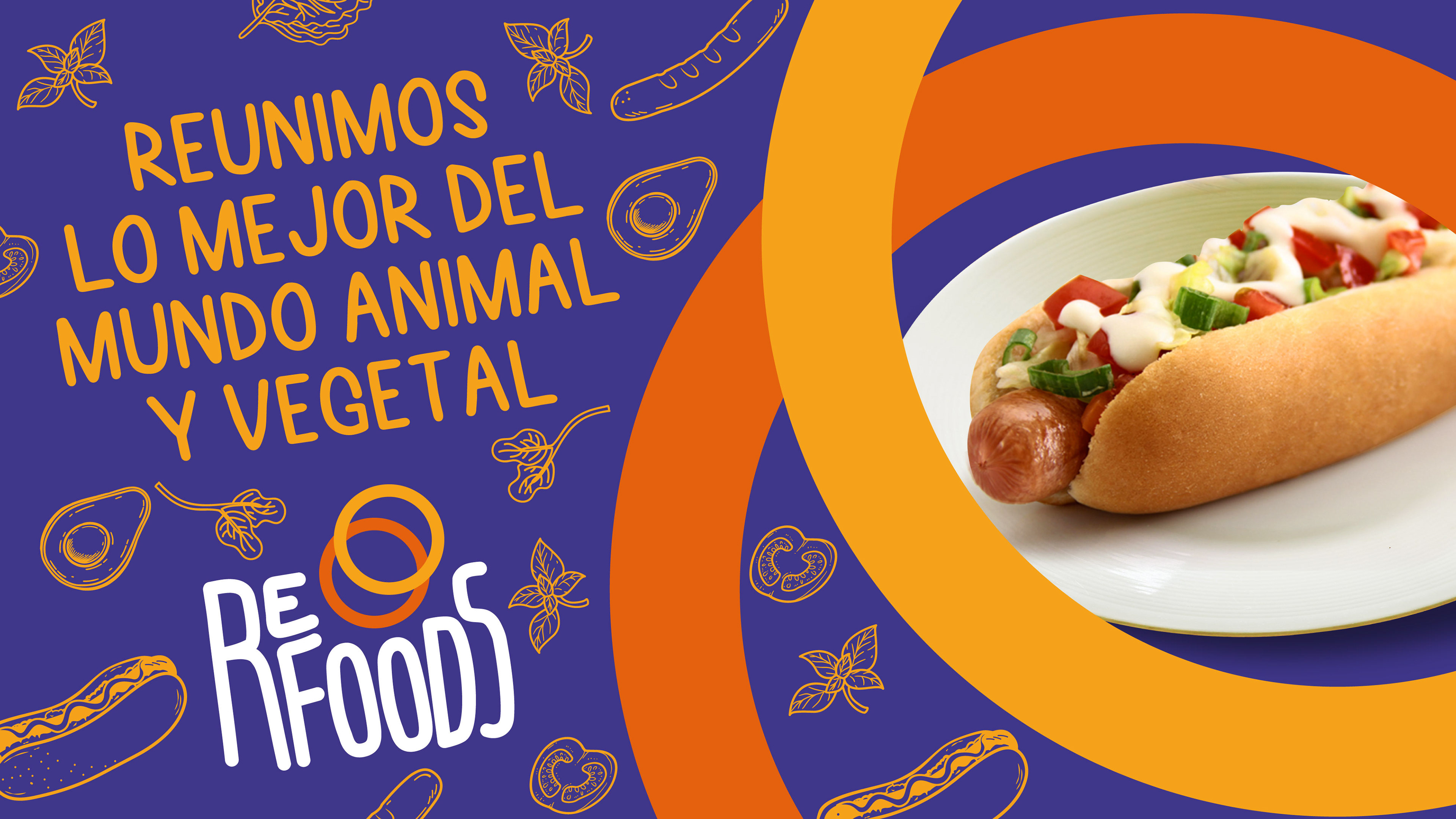
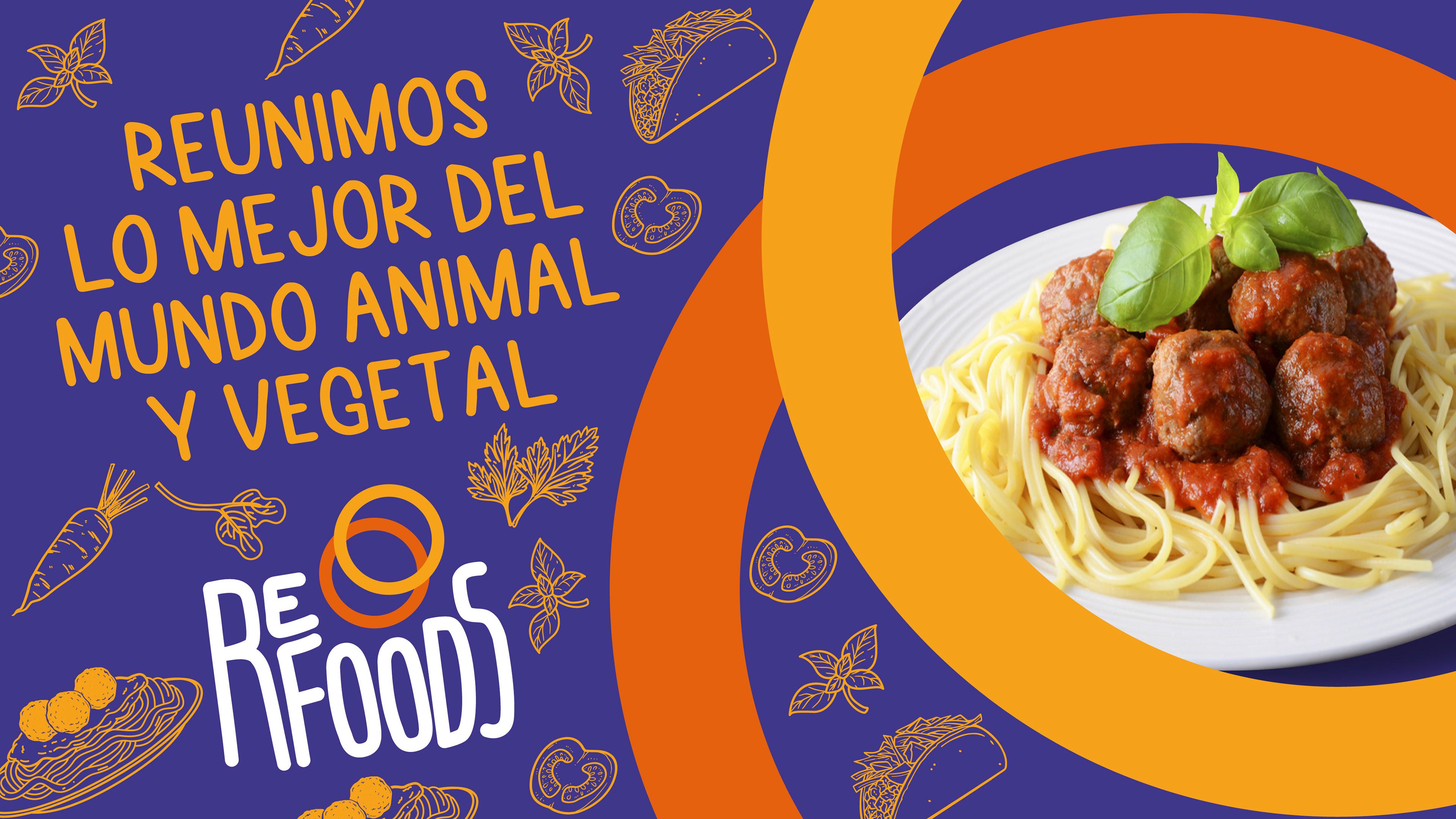
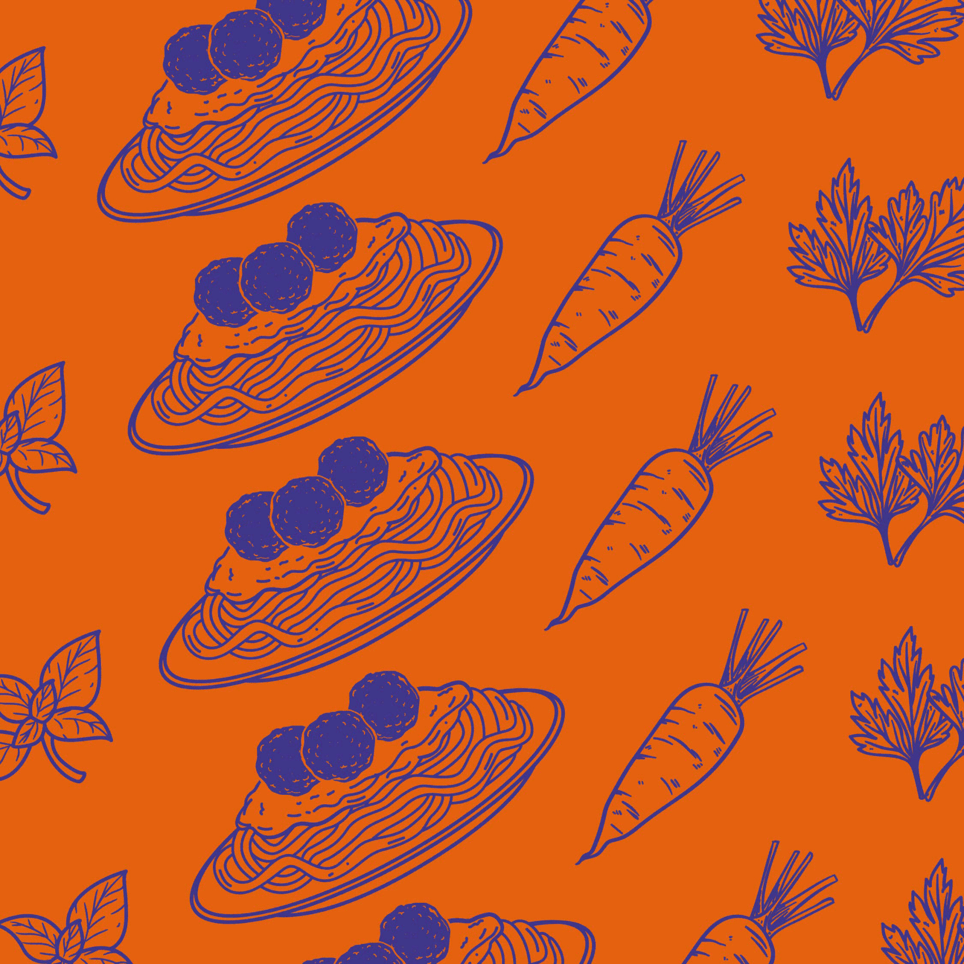
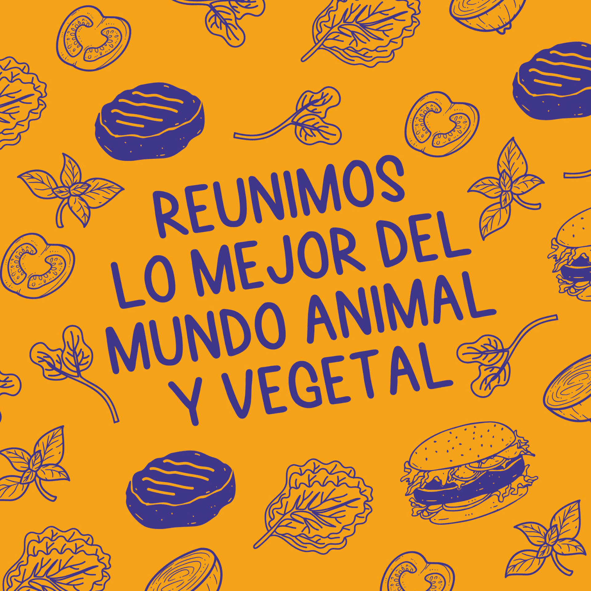
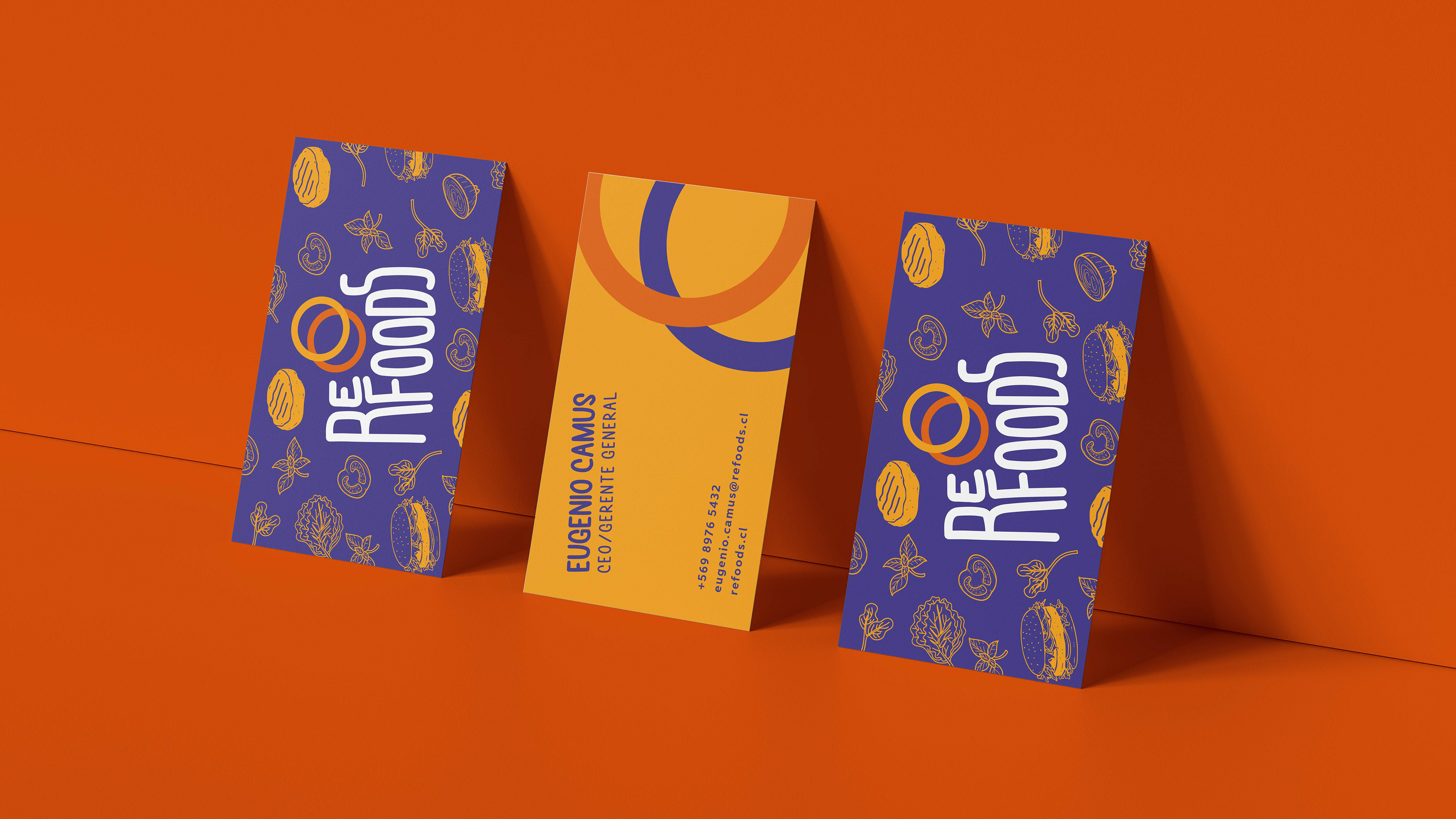
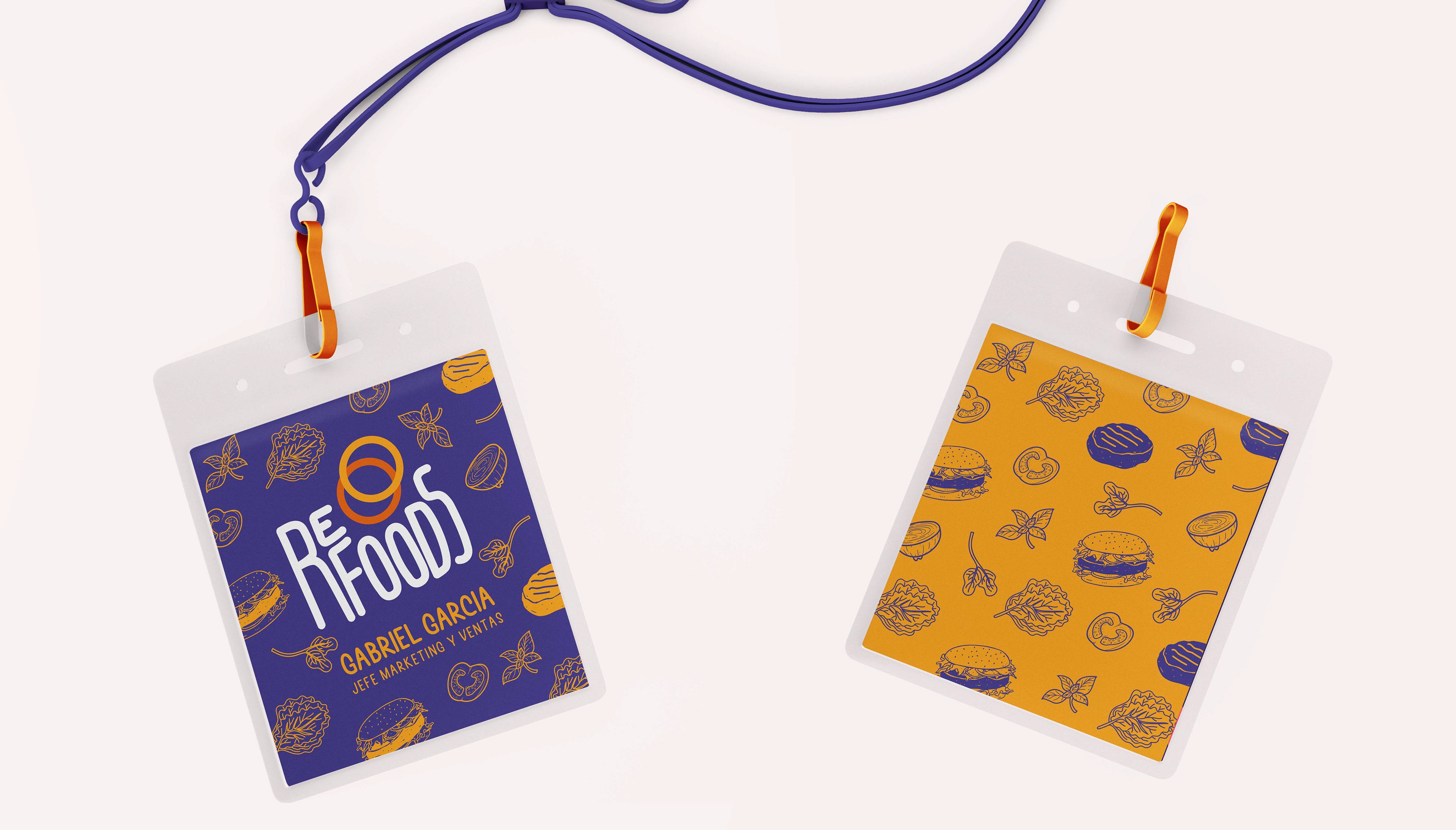
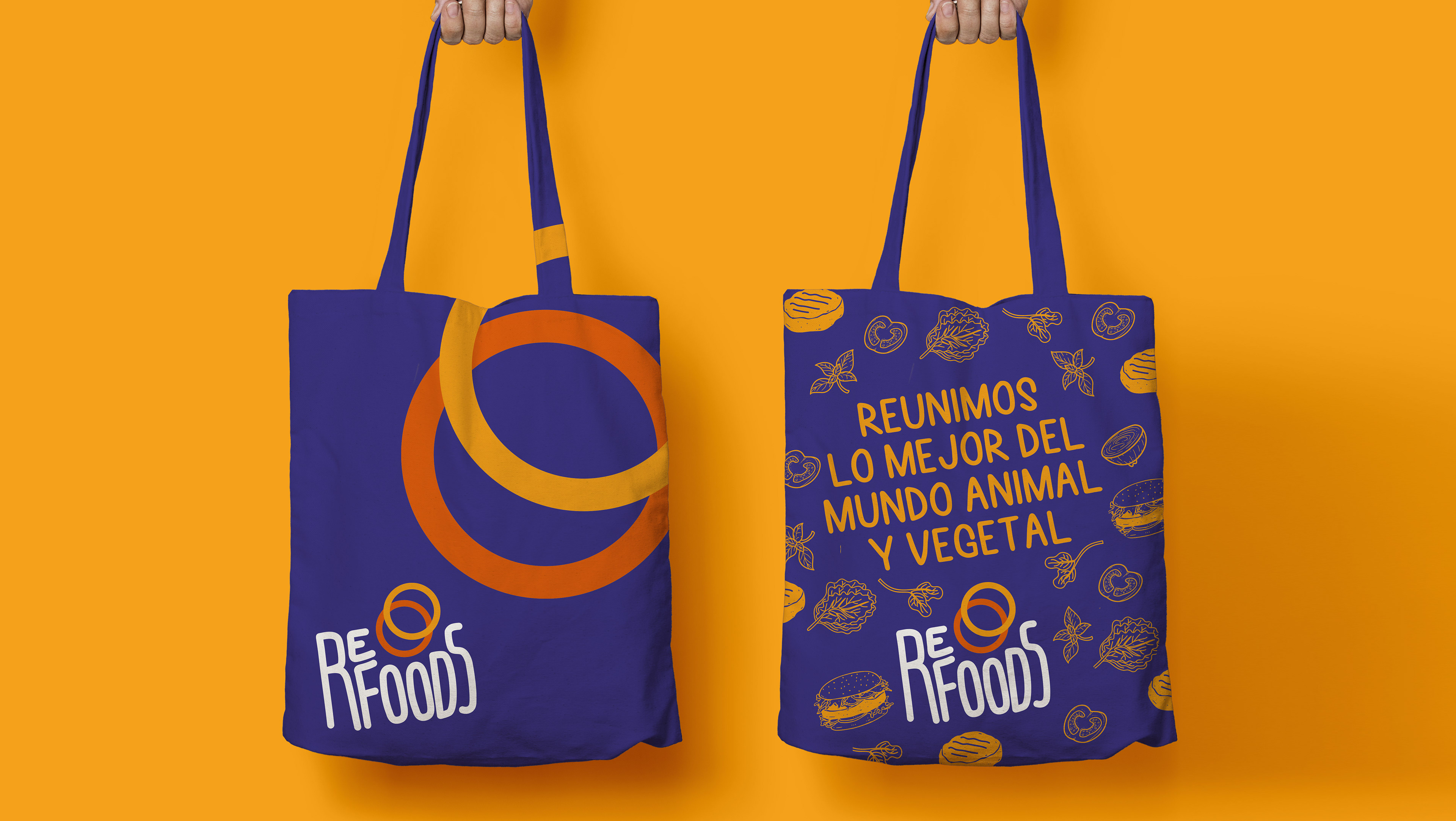
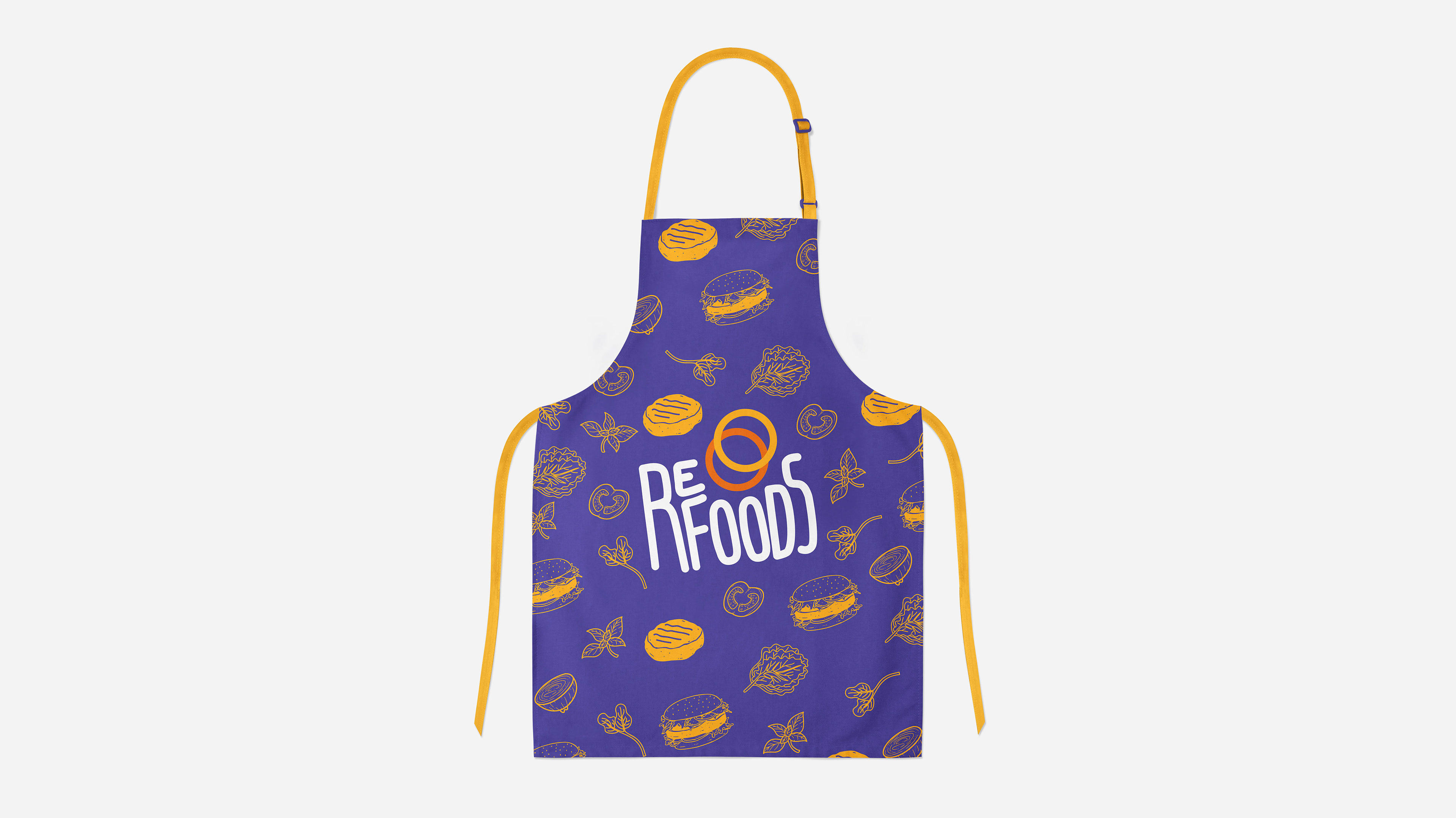
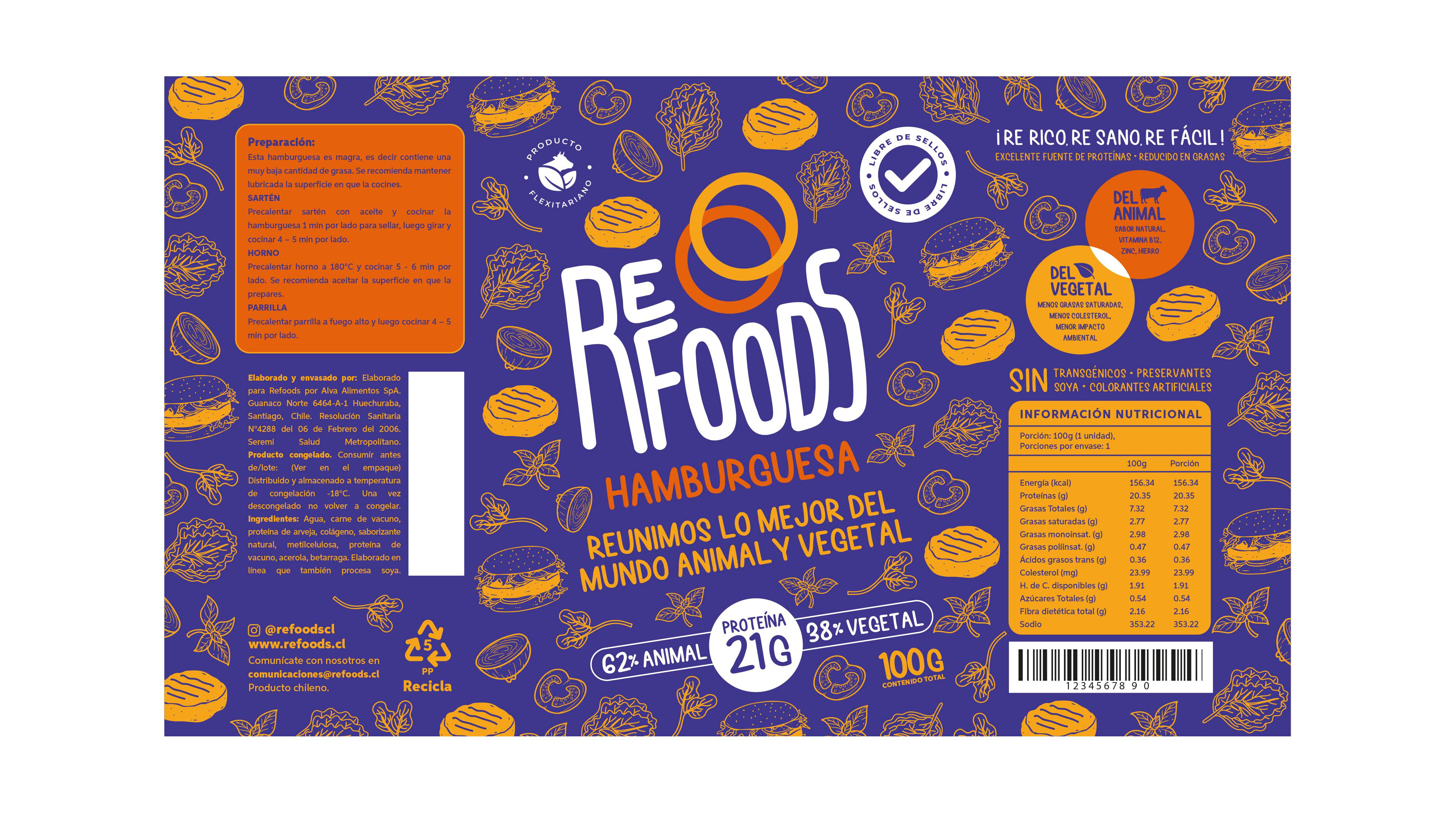
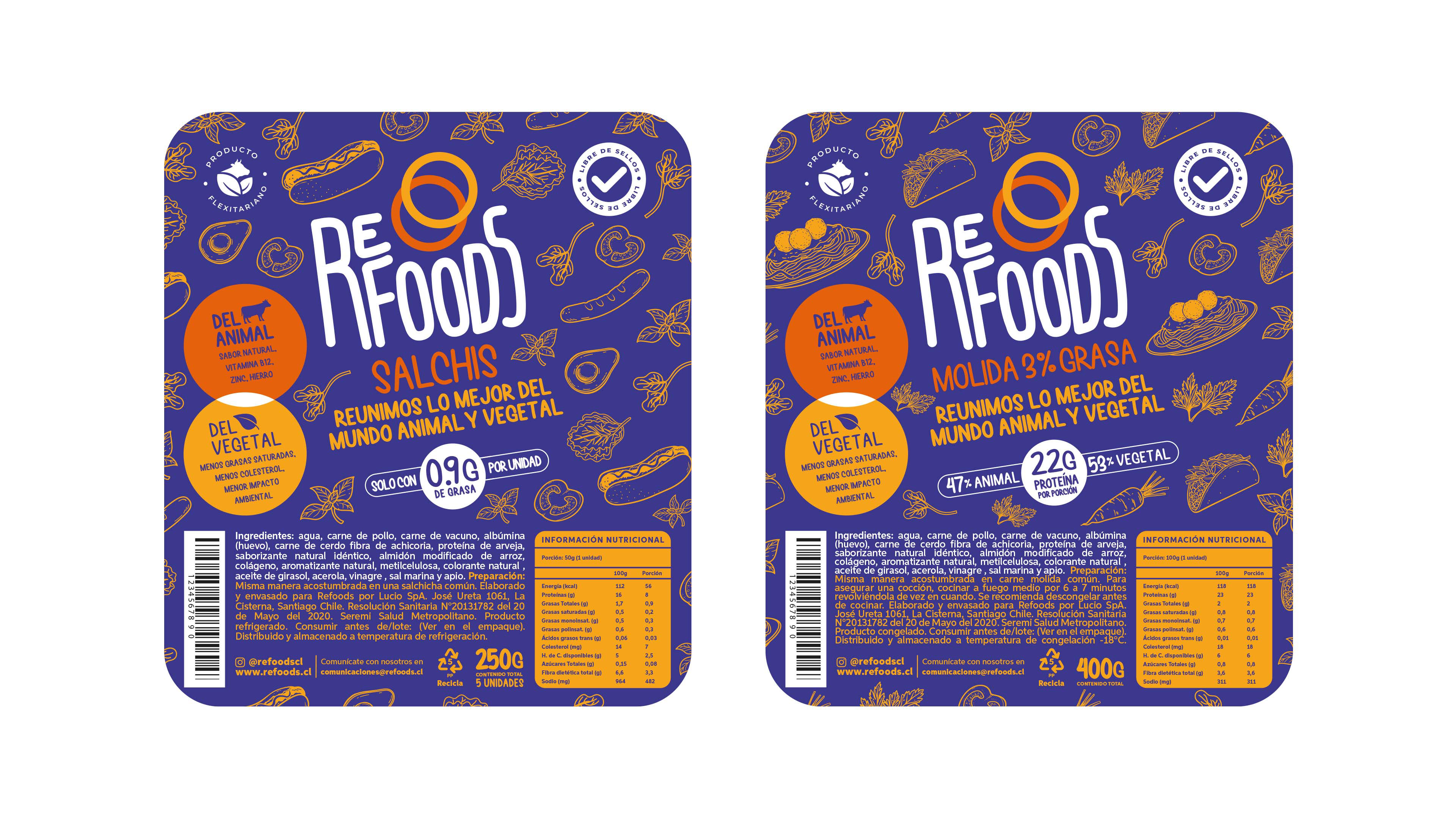
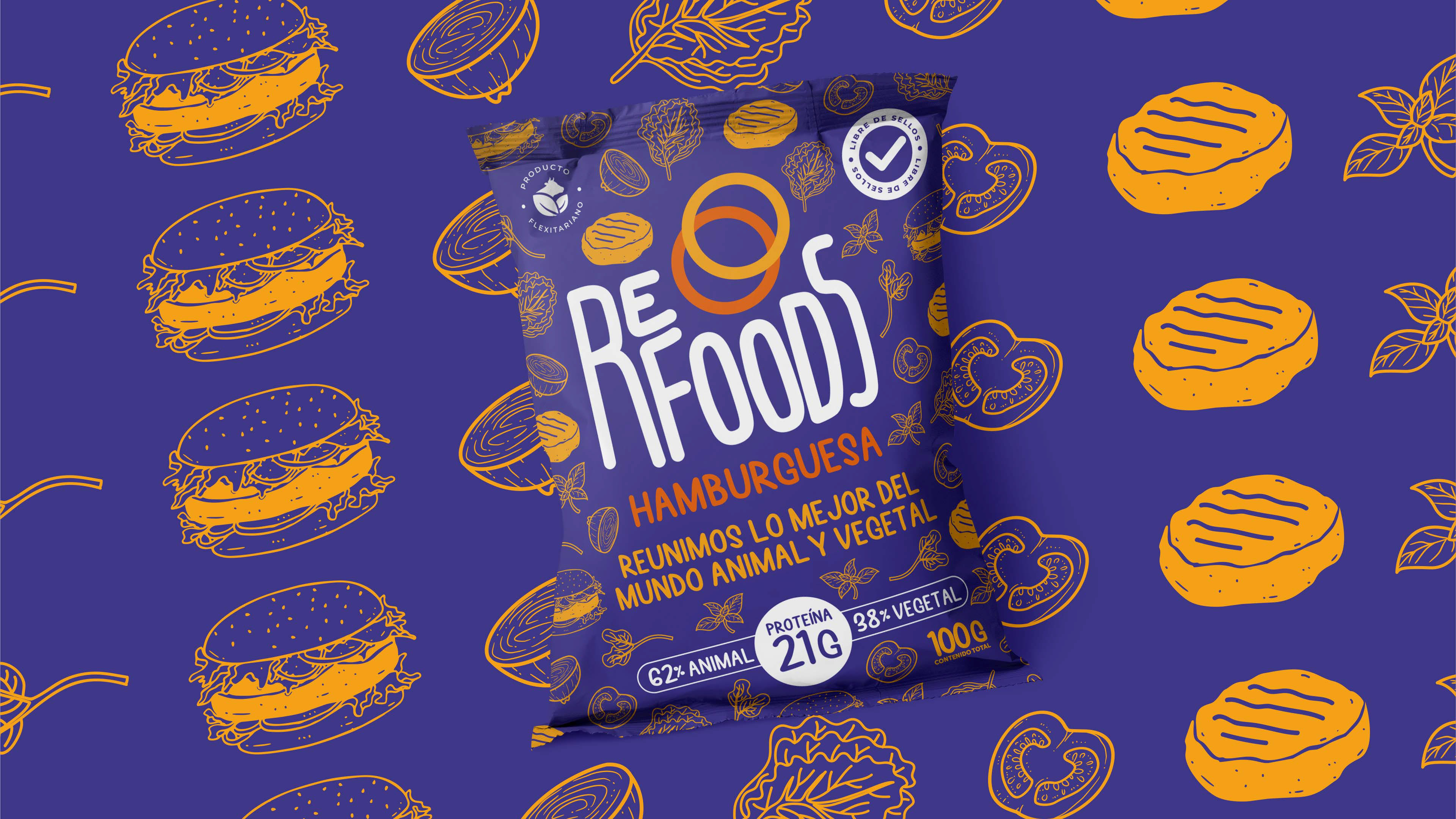
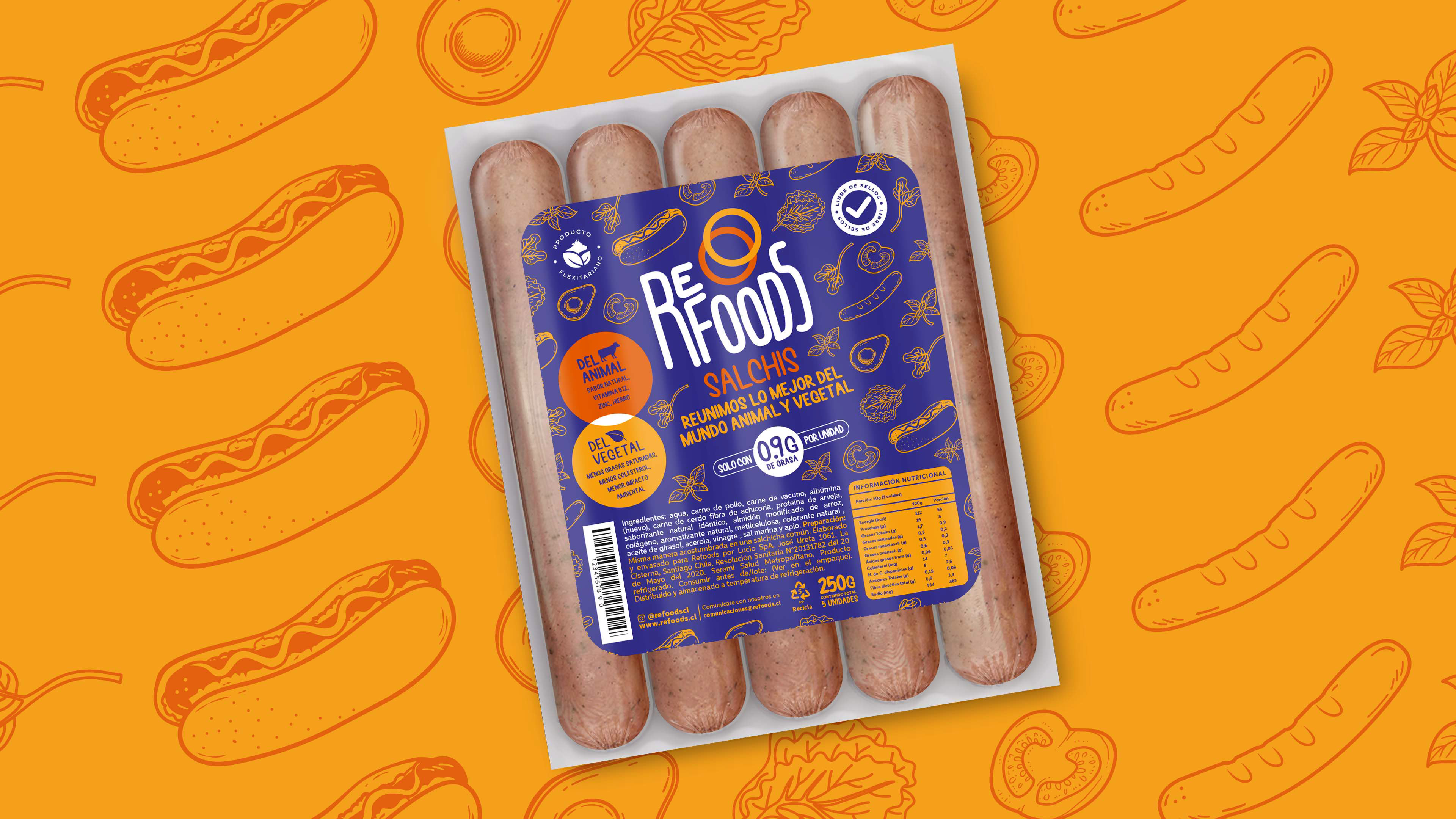
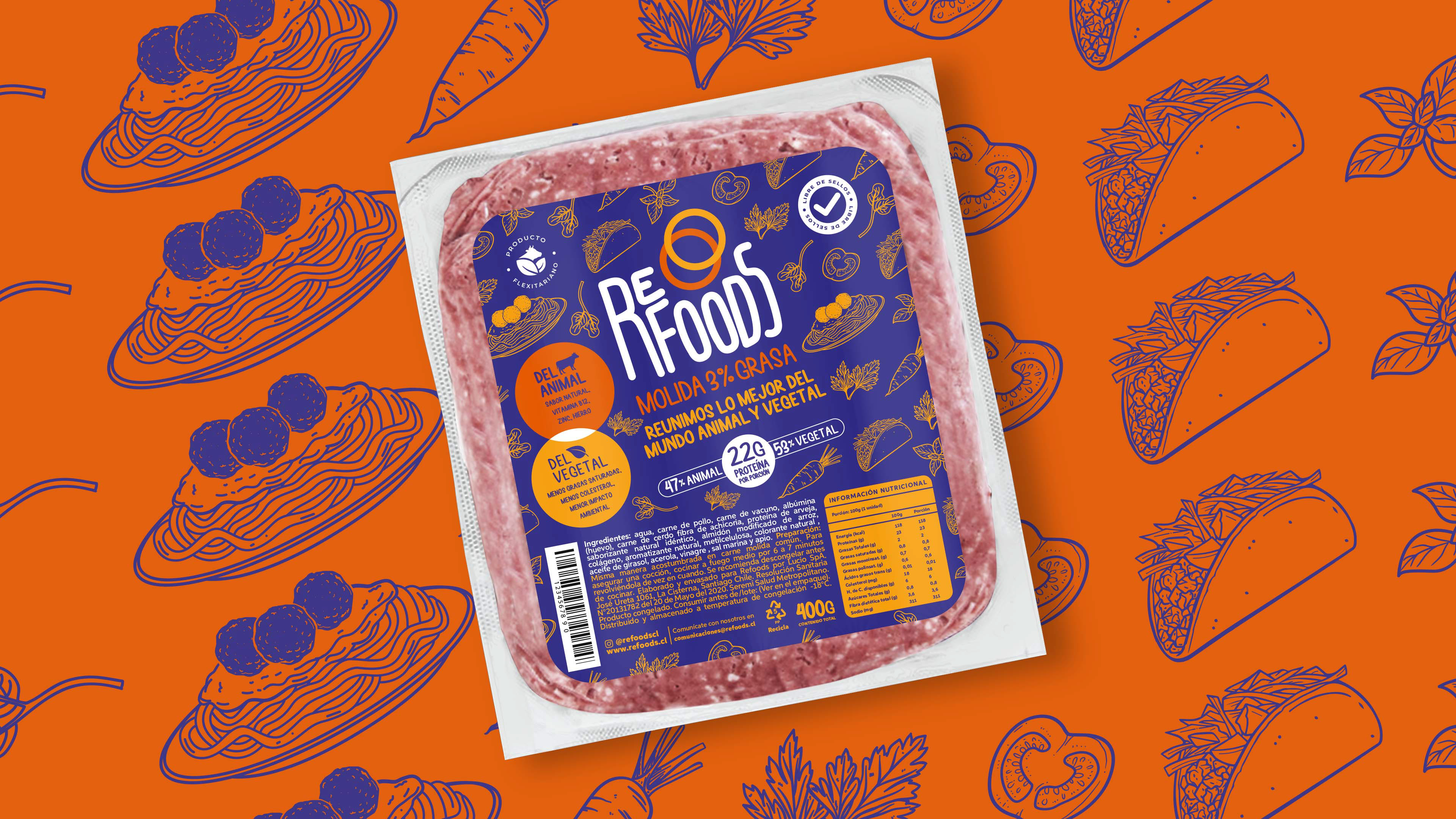
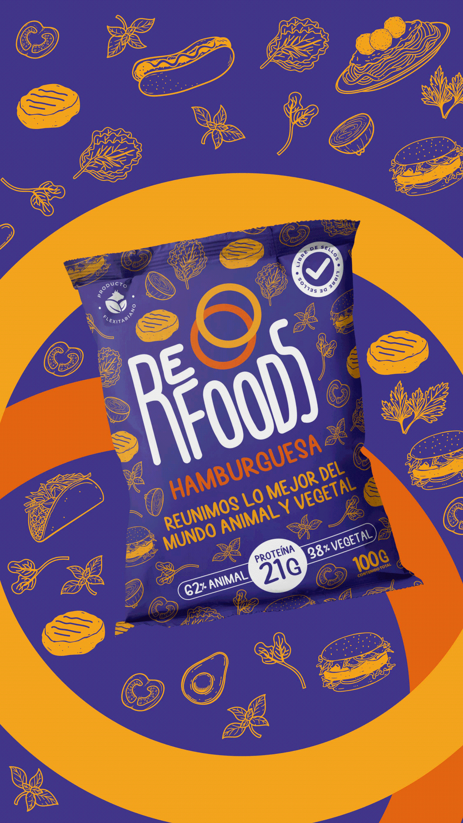
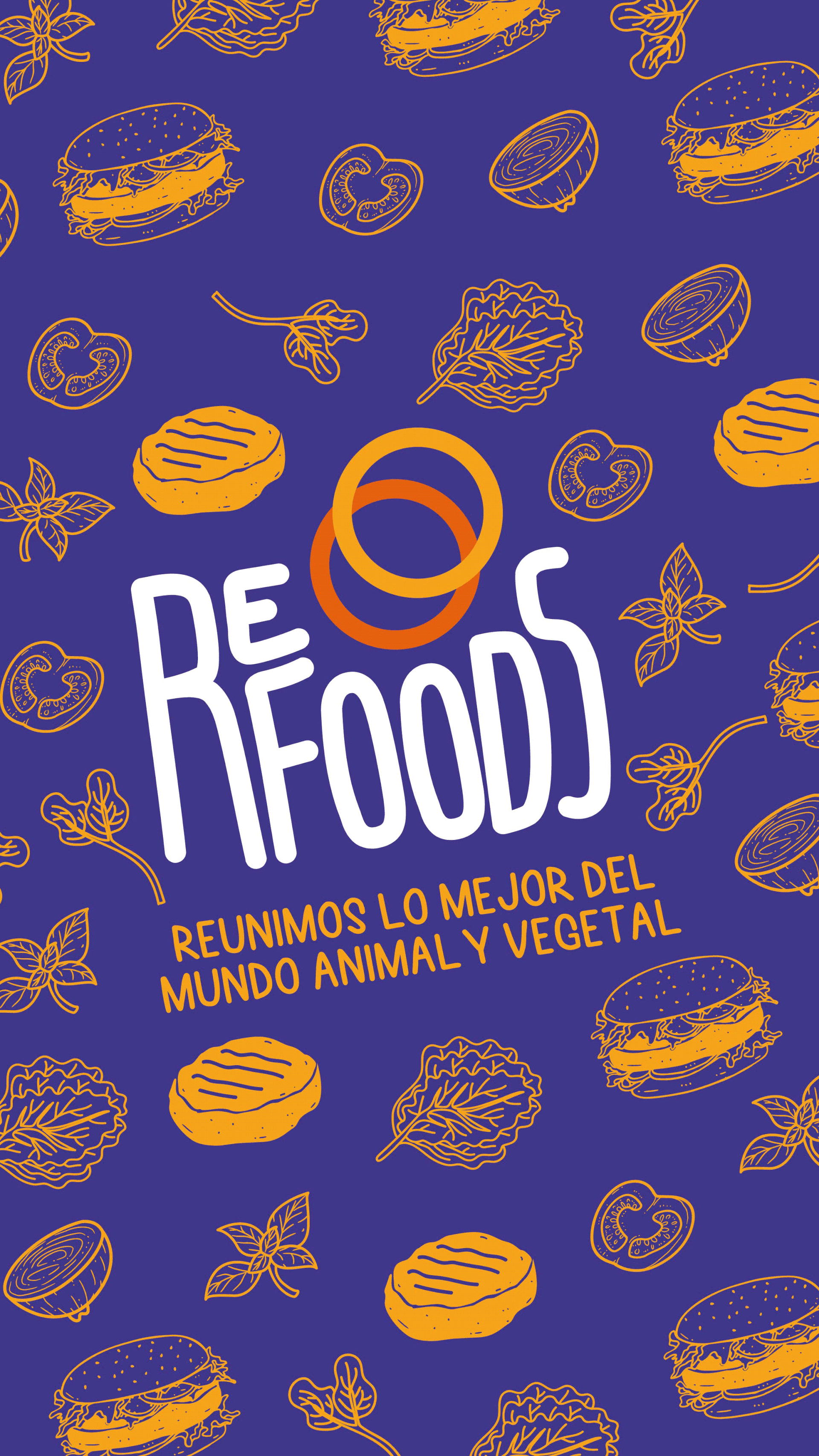
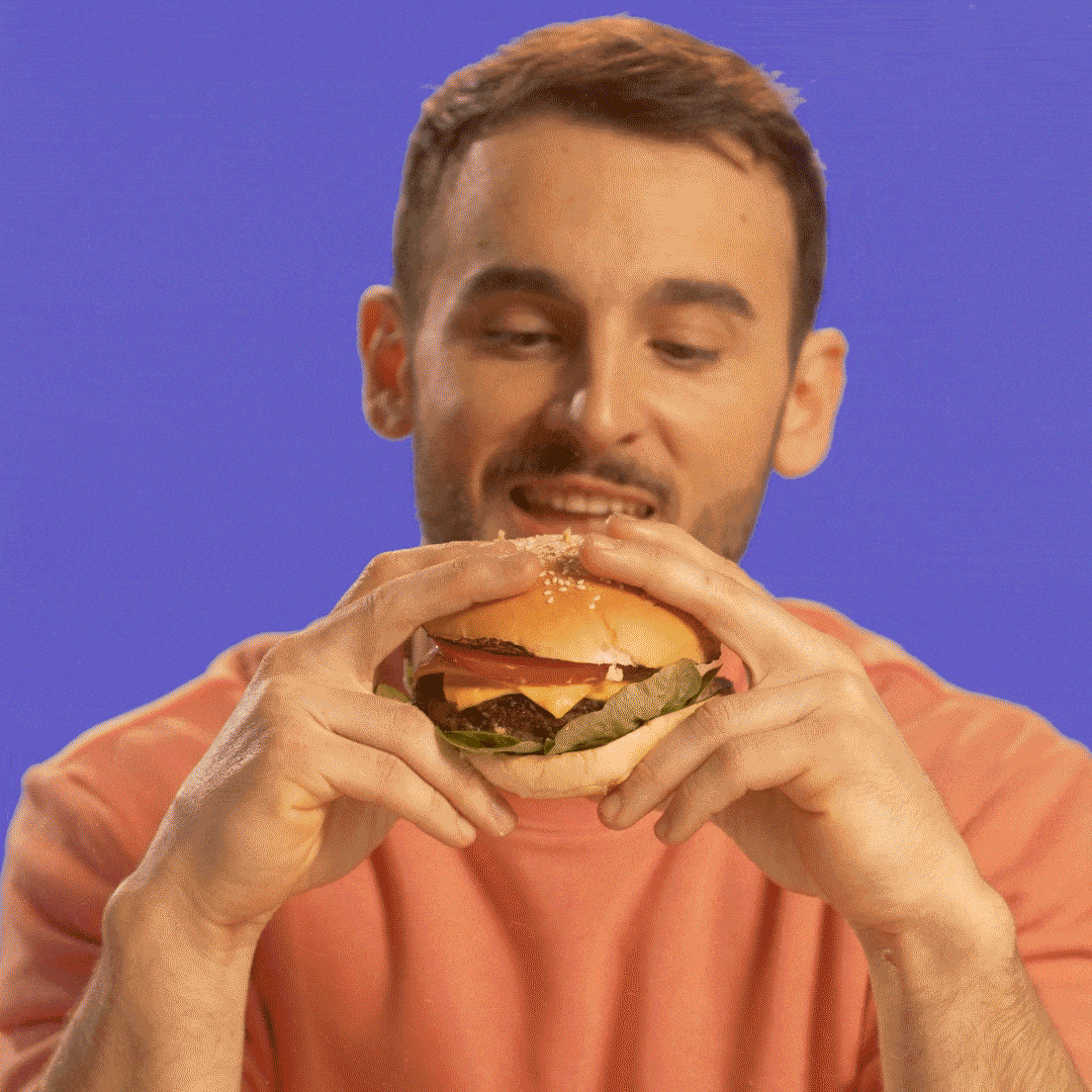
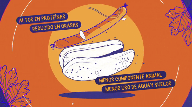
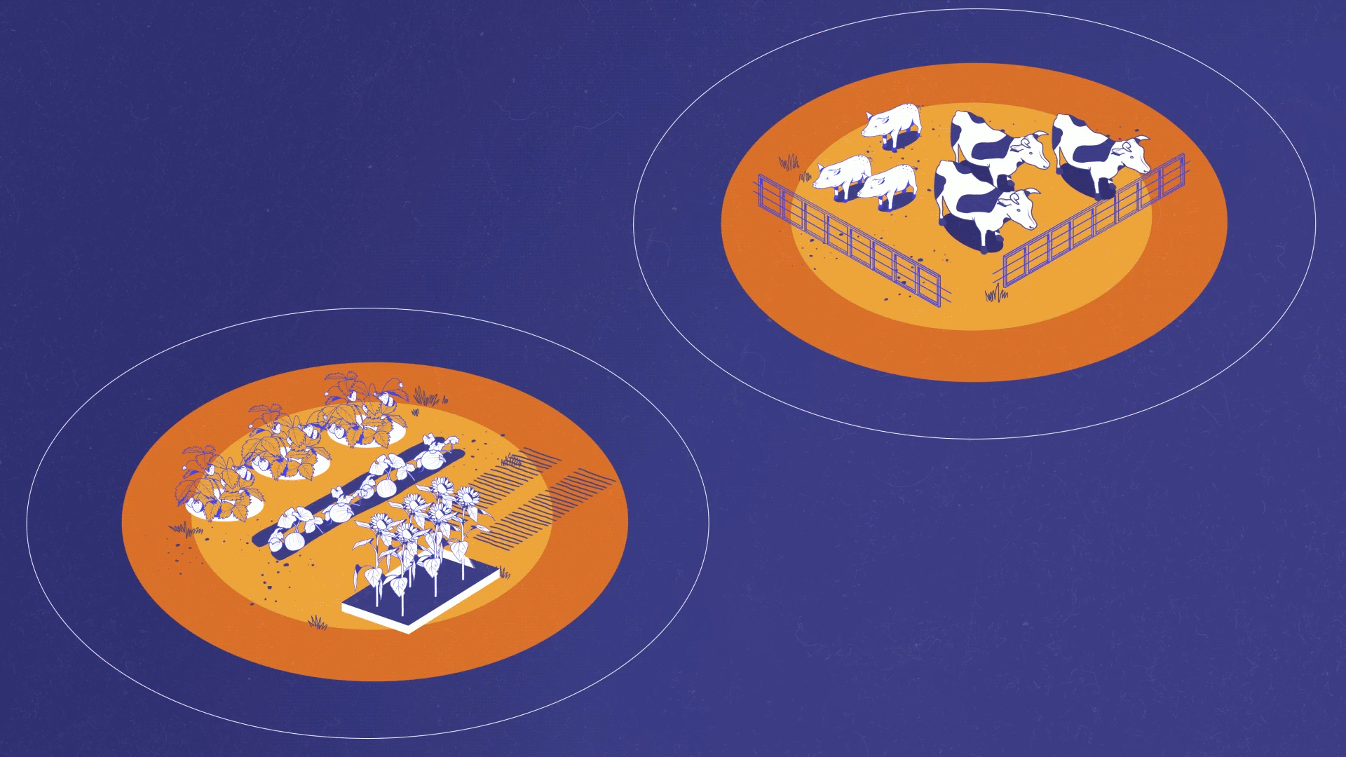
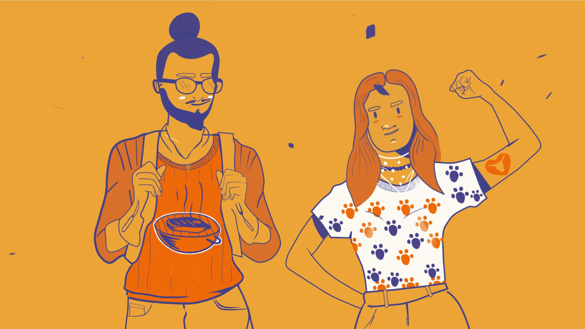
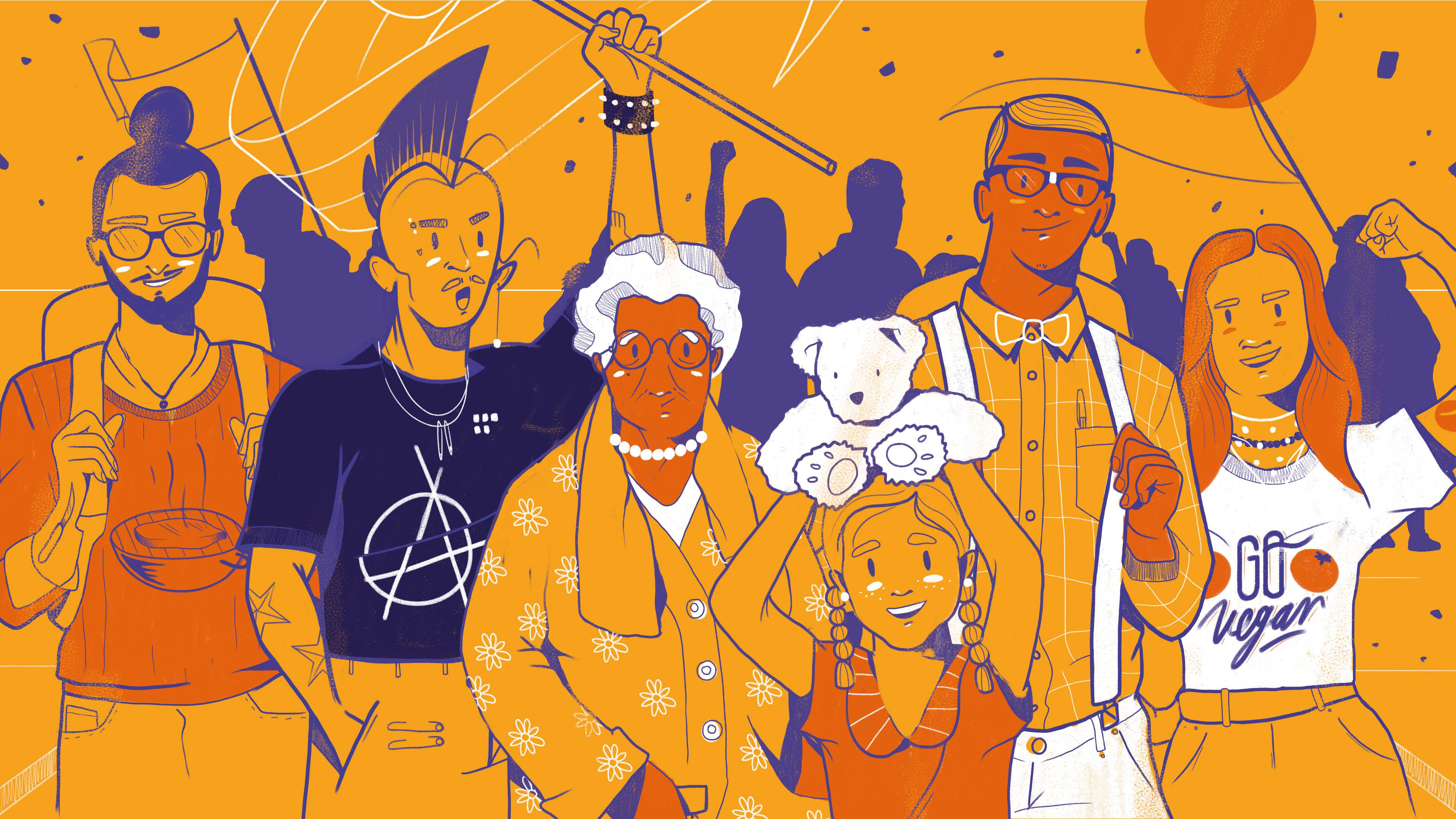
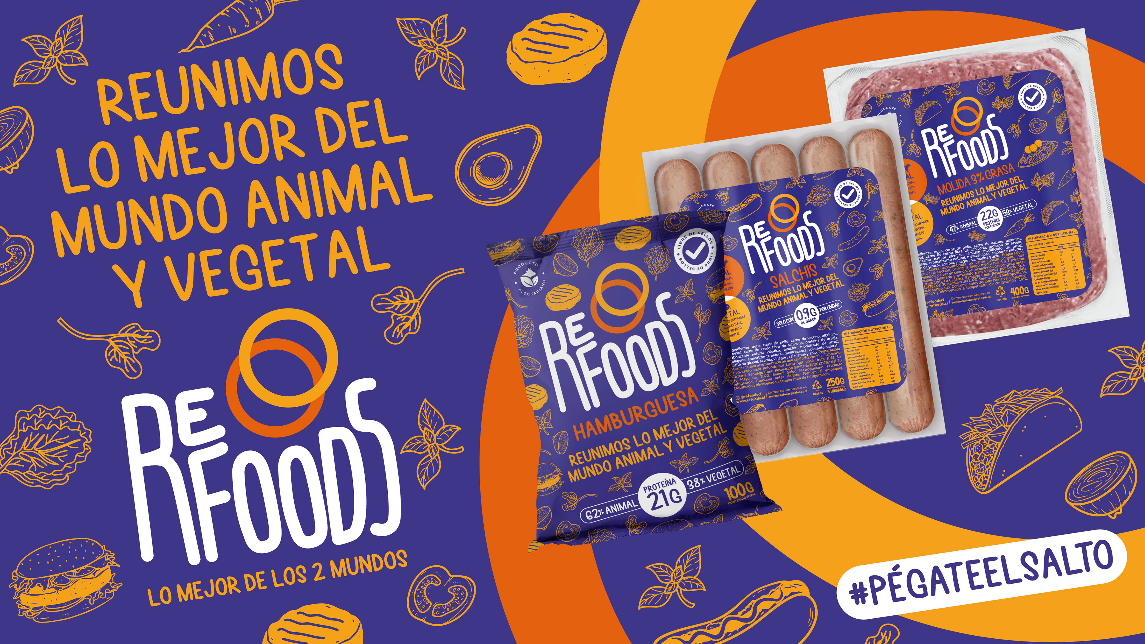
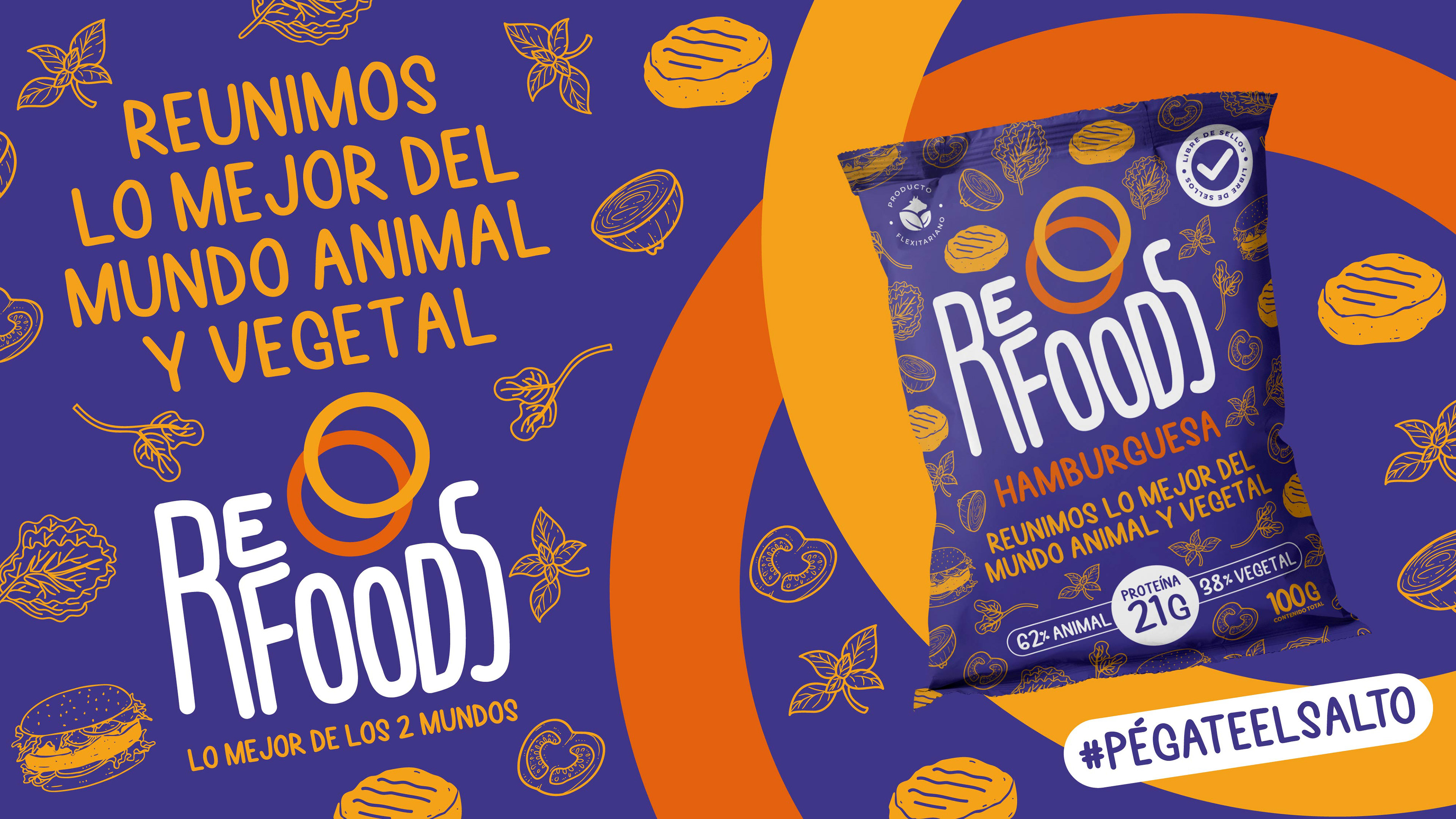
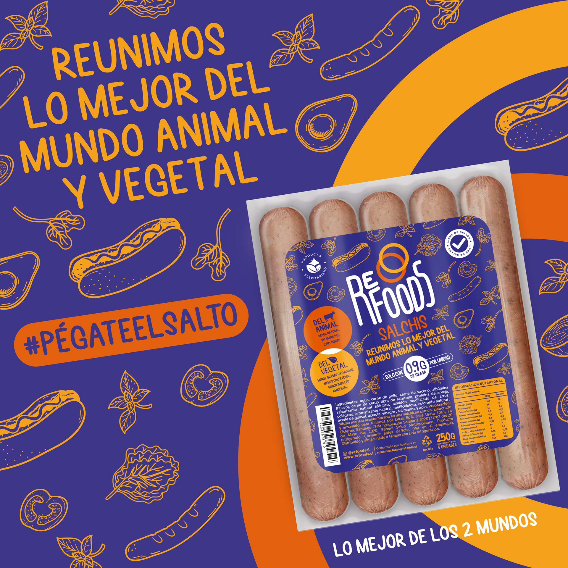
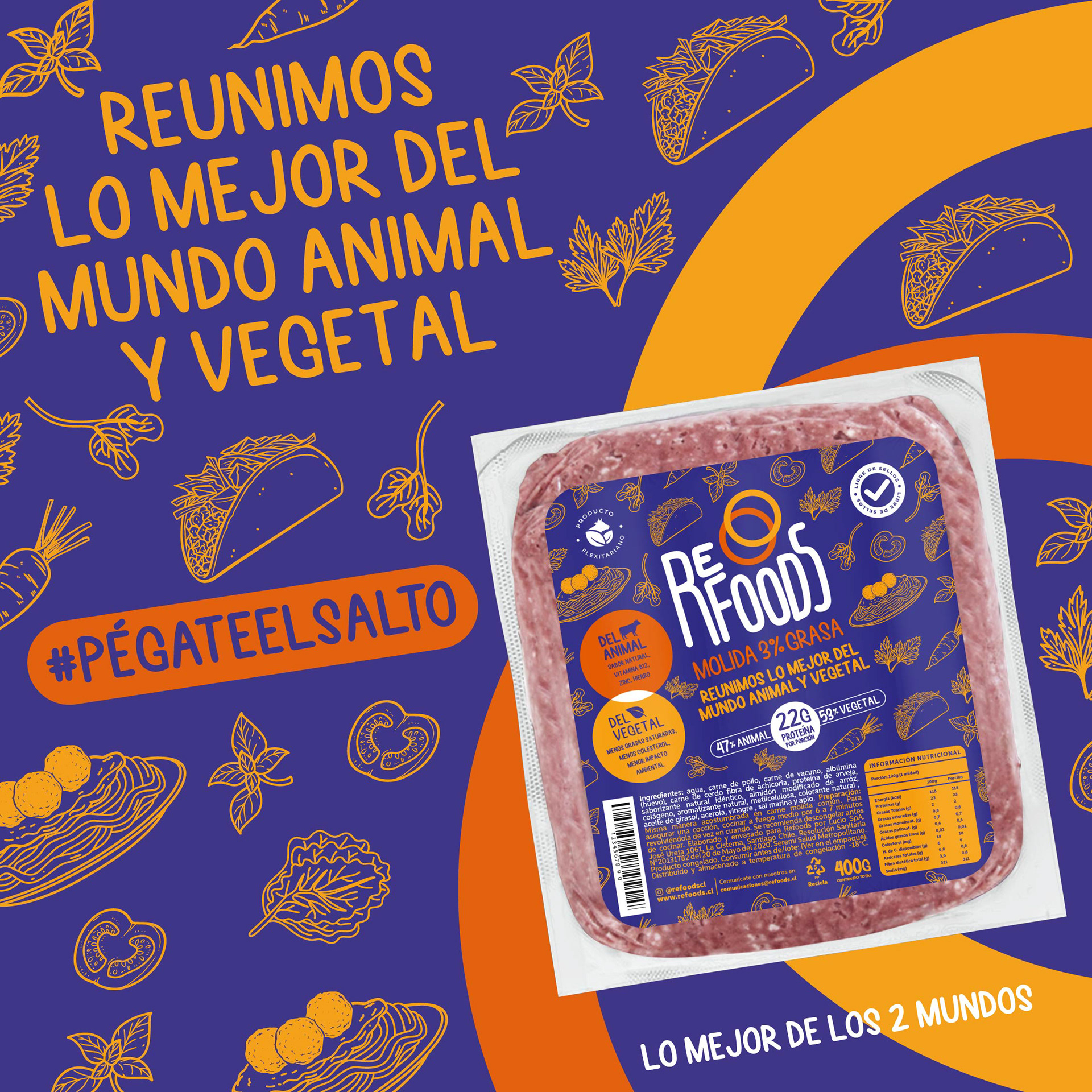
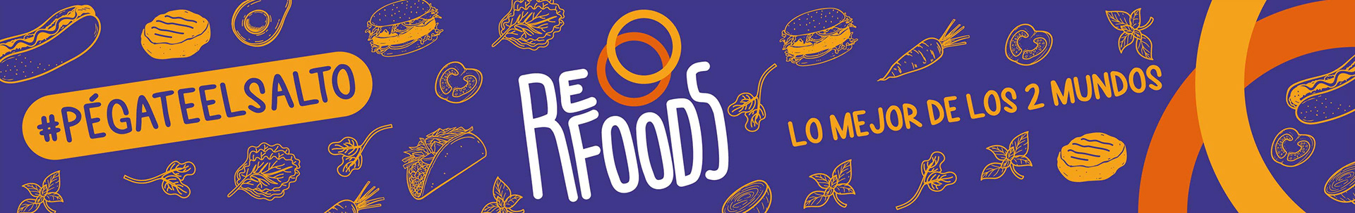
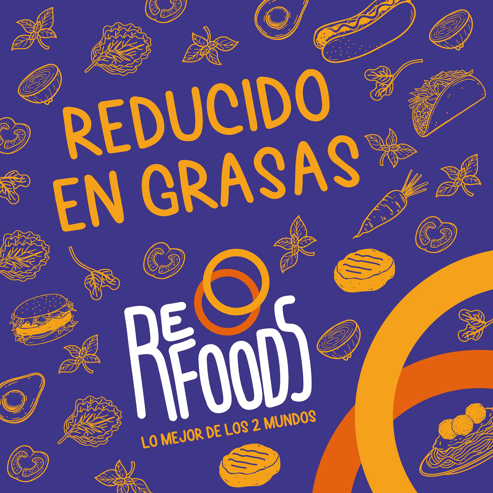
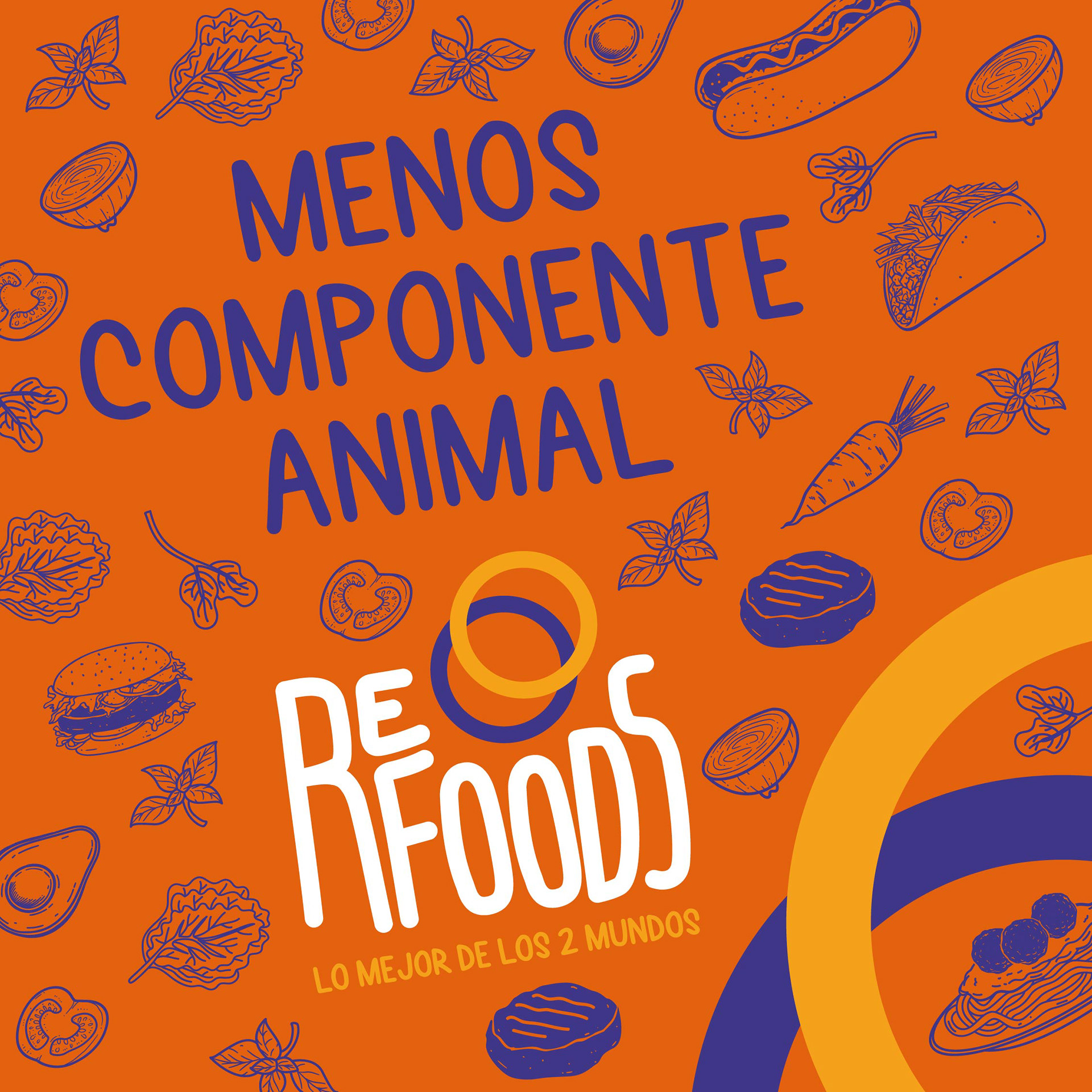
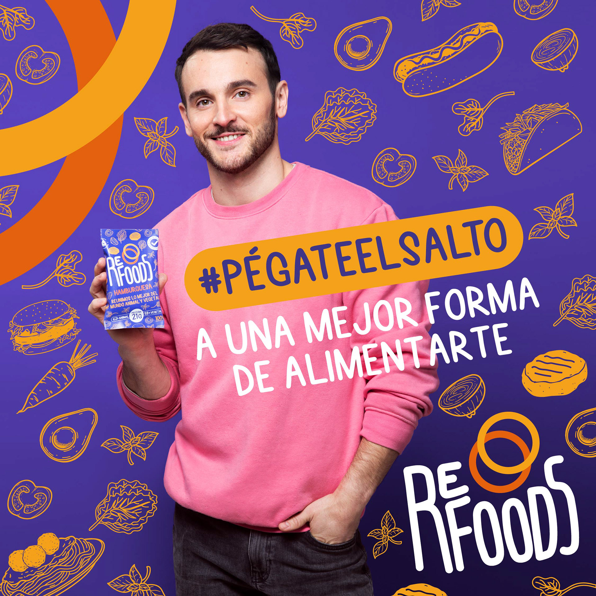
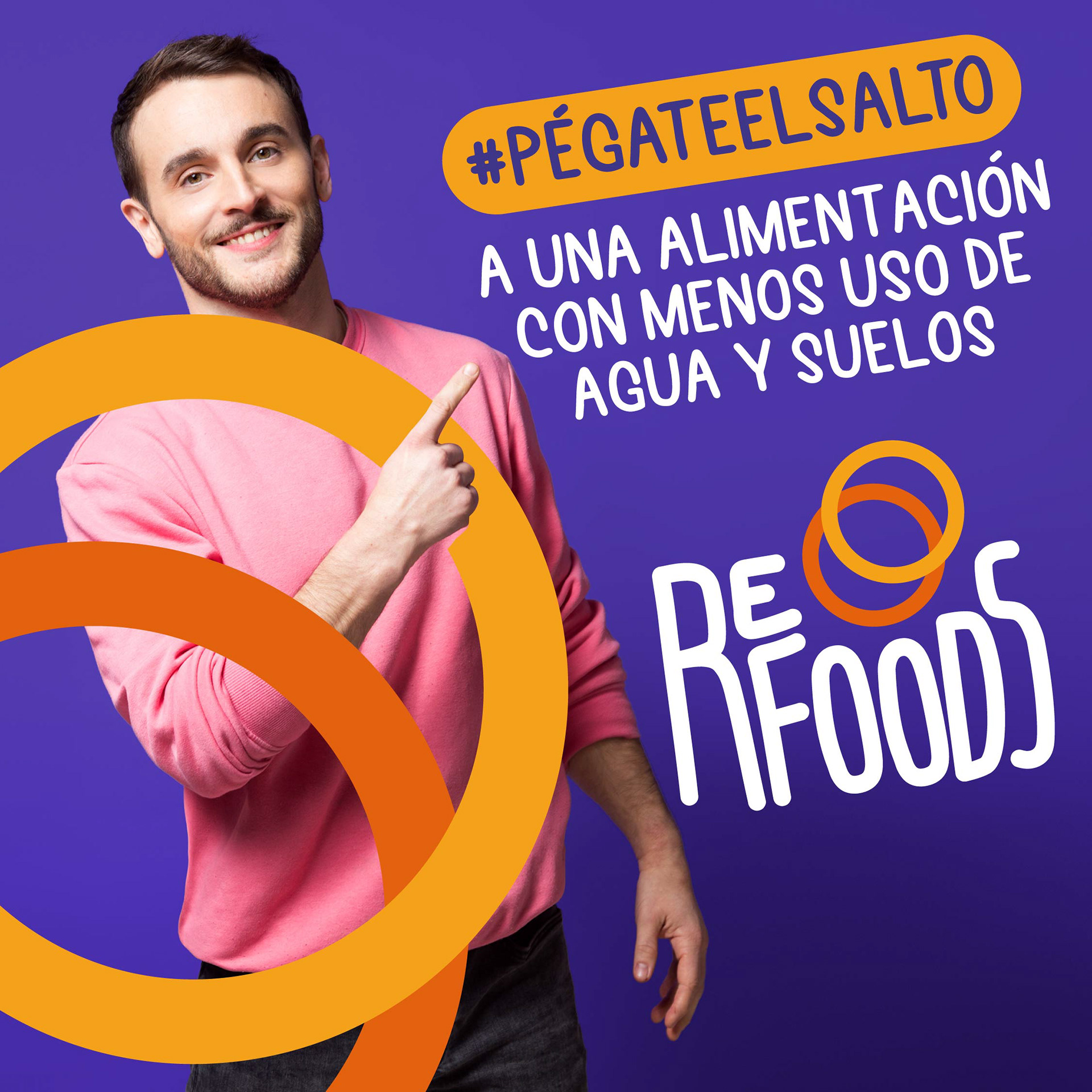
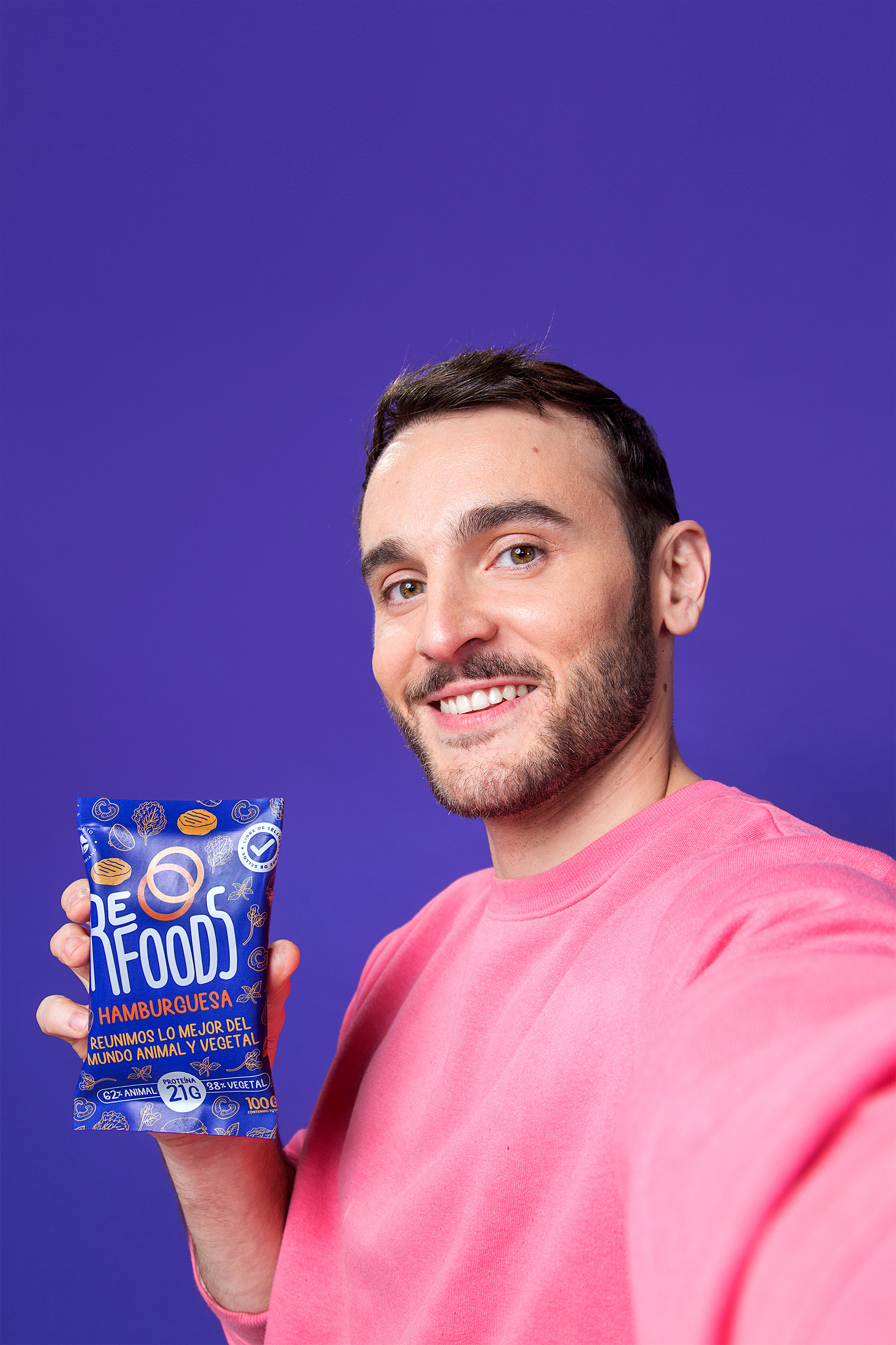
Así que centrándonos en el producto y en su filosofía de “complementariedad” con la que se estaban desarrollando las recetas, llegamos a resignificar la marca y establecer que Refoods, es reunir lo mejor del mundo animal y vegetal en cada alimento que se elabore. Concepto que llevamos a la identidad de la marca por medio de estas 2 argollas o círculos que representan la unión de estos 2 mundos, y una tipografía irregular que le da valor a lo manual, a lo artesanal y a lo imperfecto, que en el mundo de los alimentos es naturalidad.
* * * * *
When Refoods came to us, we found a young team of new leaders. In the environment there was a lot of desire to do something innovative, disruptive and with a socio-environmental sense, but if we wanted to accelerate the development of this business efficiently, we needed to find a truly unique position.
When we talk about a foodtech, all these current concepts that are in fashion come to us, such as startups, artificial intelligence, unicorns, technology, founders on magazine covers, etc. And while at the time they were an obvious novelty, today they are already part of a landscape (or language) of new brands and products in the food industry.
So that "innovation for innovation's sake" no longer made much sense, and neither did that tone of a new Elon Musk-like tech invention. If we wanted to be innovative, in this case we had to do the opposite.
So by focusing on the product and its philosophy of "complementarity" with which the recipes were being developed, we came to re-signify the brand and establish that Refoods is to bring together the best of the animal and plant world in each food that is made. Concept that we bring to the identity of the brand through these 2 rings or circles that represent the union of these 2 worlds, and an irregular typography that gives value to the manual, the artisanal and the imperfect, which in the world of food is natural.


Client: REFOODS
Creativity: FUEGO Company
Art Direction Support: Christian Carrasco
Video Content Director: Mauro Duarte
Photography: Mauricio Duarte
ID Motion Concept: Buena Suerte Estudio
Content Digital Support: Nordanth Muñoz
2021
<< WEB FUEGO